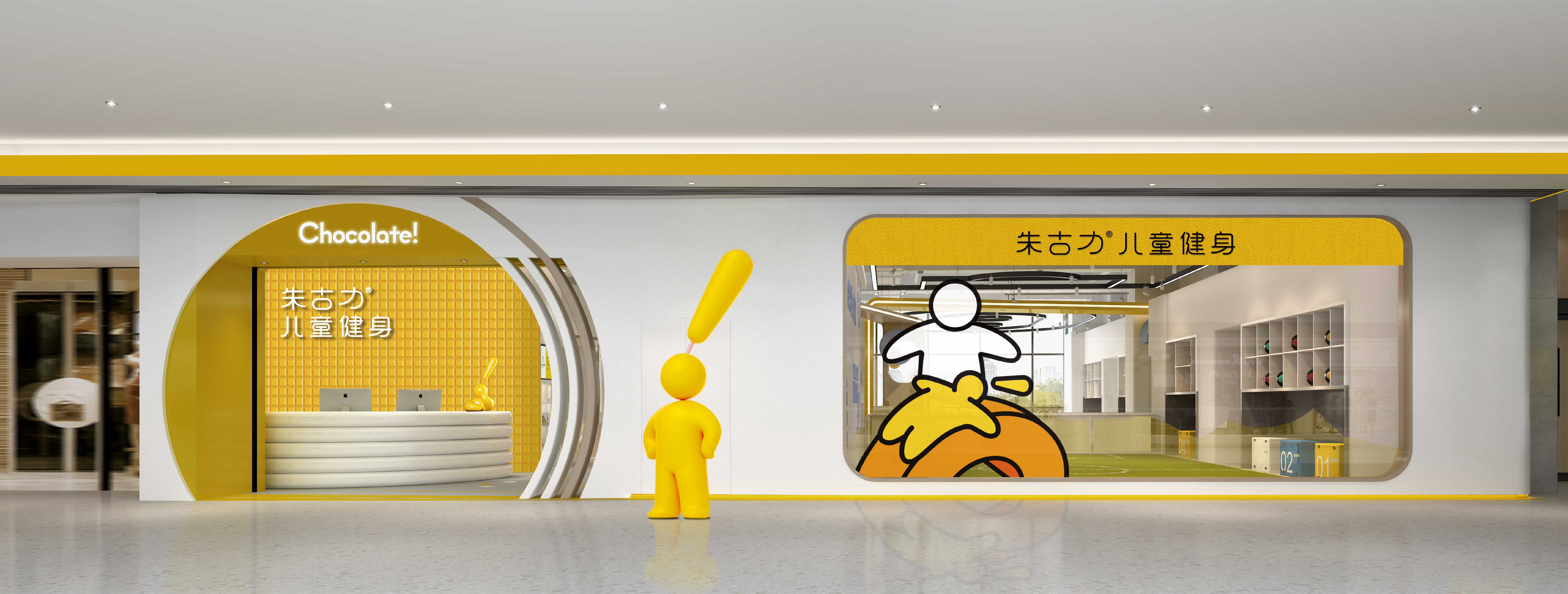
Chocolate Children`s Fitnes朱古力儿童健身
TEAMCD:彈簧D:大桥、夏夲、雨佳、橙子BS:秋秋YEAR:2021CLIENT: 朱古力儿童健身SERVICE:品牌形象
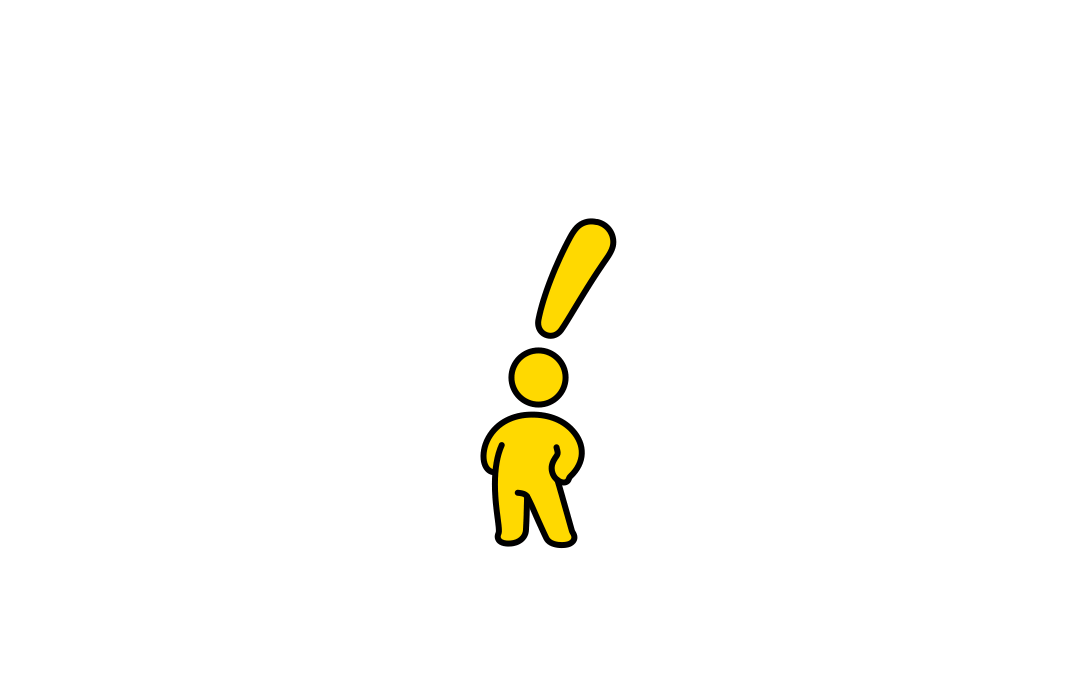
Starting from the perspective of children, the logo design takes an abstract human figure as its core visual element. The figure is presented in an upright, confident posture, expressing a sense of health, positivity, and self-assurance.
During childhood development, love, encouragement, and positive reinforcement play essential roles. We transformed these emotional expressions into a universal symbol — the exclamation mark “!”, integrating it with the character form to represent the brand philosophy of “growing with children through love and encouragement.”Through positive guidance in learning experiences, the brand aims to inspire children’s potential, nurture confidence, and support their growth through continuous encouragement.
The entire identity is designed with a sense of playfulness and vitality. The primary color, Energy Yellow, symbolizes children’s enthusiasm and endless curiosity, creating a bright, optimistic, and joyful brand atmosphere. This little character is like a pocket-sized blessing, accompanying every child along the way.
Whenever children complete their own little adventures, they receive a meaningful ending — a proud and joyful “!”
标识形象从孩子本身出发,以抽象的人物为核心要素,采用昂首挺胸的动作造型,传递出人物健康、阳光、自信的状态。
孩子成长过程中需要爱、鼓励与表扬等正面的敎导方式,把所有的情绪表达汇聚成一 个普世通用的符号⸺感叹号“!”,并将其与人物图形结合,以此传递出品牌“用爱与鼓励陪伴孩子成长”的敎育理念,在课程中用正面的引导方式激发孩子潜能,培养孩子自信,让孩子在鼓励中进步。
整体形象充满趣味与灵动,主色调为能量黄,代表着儿童的活力与热情, 给人以阳光、愉悅之感。
这个小人儿,像一枚随身的祝福。
每当孩子完成自己的“小冒险”,就给ta一个响亮的结尾——( )!
孩子成长过程中需要爱、鼓励与表扬等正面的敎导方式,把所有的情绪表达汇聚成一 个普世通用的符号⸺感叹号“!”,并将其与人物图形结合,以此传递出品牌“用爱与鼓励陪伴孩子成长”的敎育理念,在课程中用正面的引导方式激发孩子潜能,培养孩子自信,让孩子在鼓励中进步。
整体形象充满趣味与灵动,主色调为能量黄,代表着儿童的活力与热情, 给人以阳光、愉悅之感。
这个小人儿,像一枚随身的祝福。
每当孩子完成自己的“小冒险”,就给ta一个响亮的结尾——( )!