ANIMO OMNIS
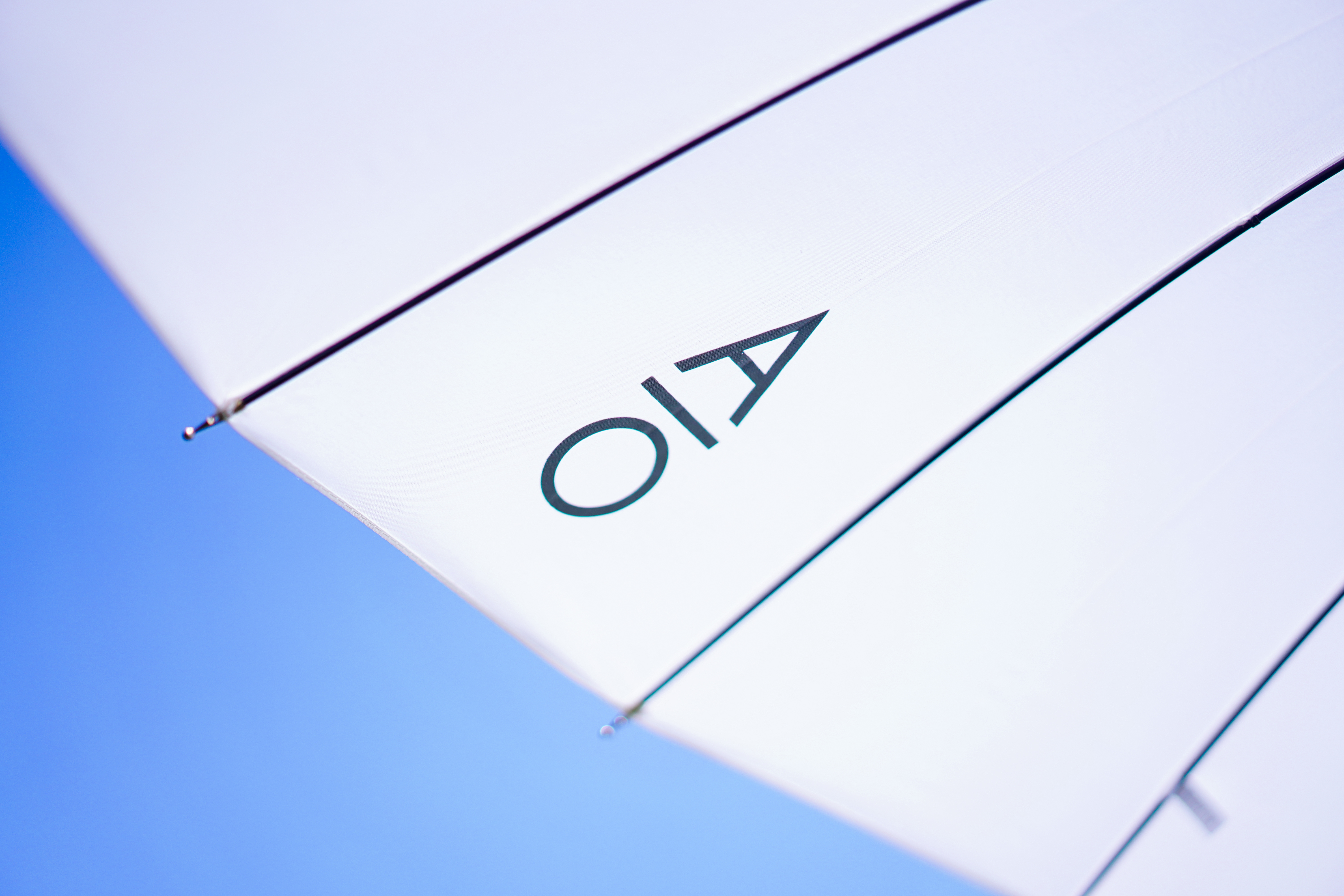
TEAMCD:弹簧D:陈一枪、钟宁、王帅AE:秋秋YEAR: 2020CLIENT: ANIMO OMNISSERVICE:标志设计、视觉识别系统、包装设计HIiibrand Awards 2020 优异奖
In order to solve understanding and memory difficulties of "Animo Omnis" in Chinese context, we extracted the initial letters AO as the abbreviation of the brand name, so that it can be identified and spread more quickly. When transforming the concept of "balance" into visual communication, we adopted an extremely clear, concise and circulating symbol--the horizontal line--which stretches. straight and is unbiased. This horizontal line cleverly echoes the original phonetic symbol of the lowercase letter o in Animö Omnis.
为了解决“AnimoOmnis”在中文语境下的阅读障碍和记忆困难,我们提取了单词首字母AO,作为品牌名称简写,使其能够被更加快速地识别和传播。 将「平衡」概念转化为视觉传达时,我们采用了一个极其清晰、简练、流通的符号——横线一 它笔直舒展,不偏不倚。这条横线与AnimoOmnis中,小写字母。原有的音标巧妙呼应。我们 将它介入到A与O两个字母之间,调整间距与比例关系,构建出AO专属的品牌图形,成为品牌宝贵的视觉资产。