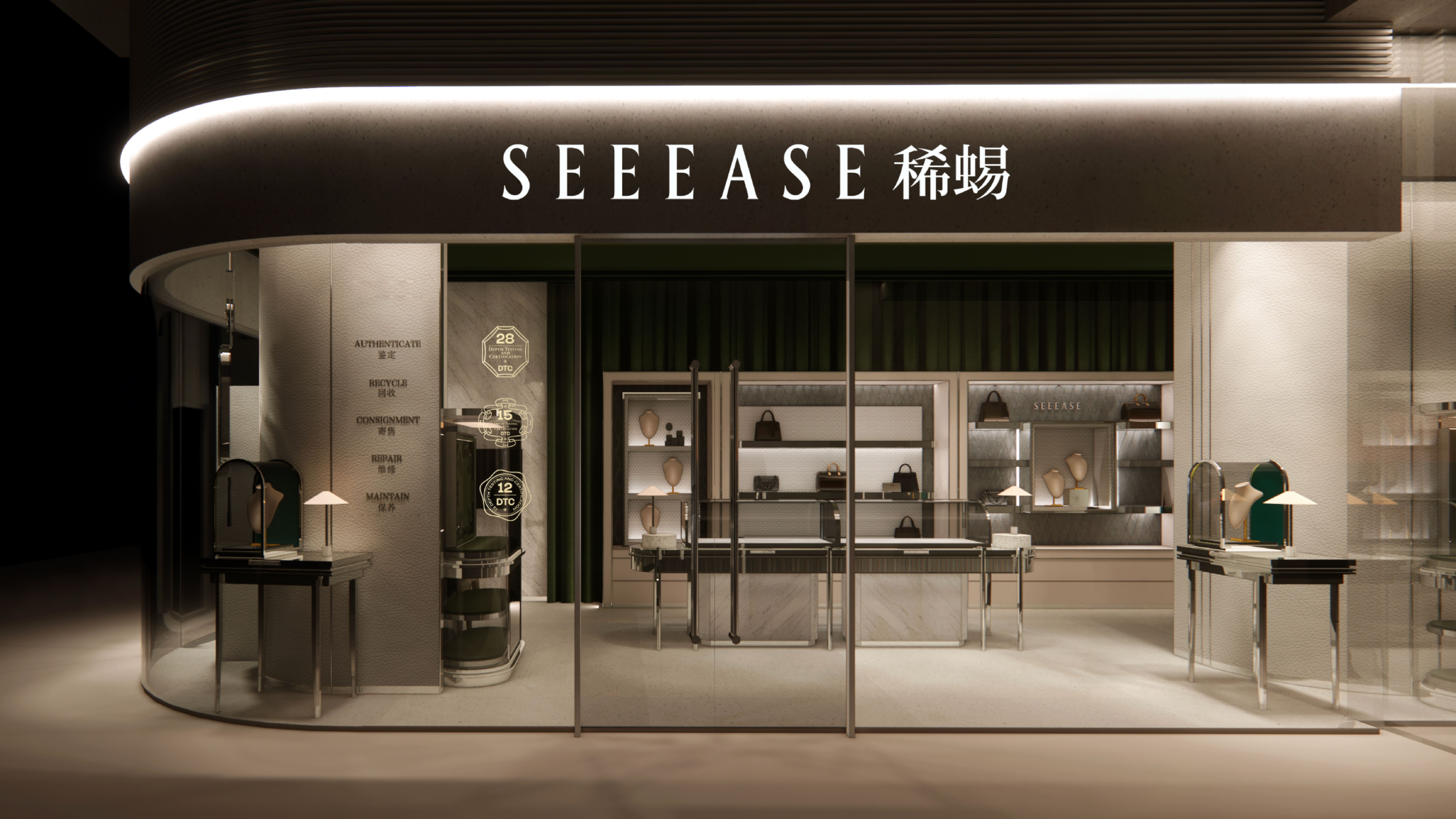
SEEEASE 蜥蜴
TEAMCD:弹簧、大勇D:邓德、夏夲、大桥、张帅AE:王二YEAR: 2024CLIENT: 稀蜴 SEEEASESERVICE:标志设计、视觉识别系统
This is the brand identity upgrade we developed for SEEEASE (稀蜴). SEEEASE is a full-chain secondary luxury watch trading service platform specializing in mid-to-high-end timepieces worldwide. It offers a one-stop solution spanning new and pre-owned transactions, authentication, valuation, buy-back and recycling, consignment, as well as repair and maintenance. Committed to building one of China’s leading trustworthy trading ecosystems, SEEEASE aims to enhance circulation efficiency in the luxury market and strengthen consumer confidence.
Grounded in our brand analysis, we set “Time Makes Classics” as the creative starting point. A classic serif typeface was selected to convey the brand’s calm, refined, and elegant character. The construction of the letterform draws inspiration from the octagonal structure of luxury watch packaging, while incorporating the cultural imagery of the Eastern “Eight-Treasure Box,” symbolizing the gathering of rare and precious pieces.
This concept evolves into a “Wheel of Time”—representing the flow of time and the precision of its markers, while also carrying the auspicious meaning of prosperity from all directions. By integrating cultural warmth within a rational structure, we shaped a visual identity system that balances order with emotion.
我们为「稀蜴 SEEEASE」打造的品牌形象升级方案。稀蜴 SEEEASE是一家专注于全球中高端腕表奢品的二奢全链路交易服务平台,SEEEASE 提供覆盖新旧交易、鉴定、估价、回收、寄售到维修保养的一站式服务,致力于构建国内领先的诚信交易生态,提升奢侈品流通效率与消费信任。
我们通过品牌分析,以“时间成就经典”为设计起点,选用经典衬线体,传达品牌沉稳、优雅的气质。字母图形的构造灵感来自腕表包装盒的八边形结构,并融合东方“八宝盒”意象,寓意臻品汇聚、珍稀可贵。
由此构成的“时间之轮”,象征时间的流动与刻度,也寄寓“八方来财”的美好祝愿。在理性结构中融入文化温度,塑造出兼具秩序与情感的品牌视觉体系。