HEY.YOUNG贝壳海盐公寓
TEAMCD:弹簧SD:木村D:大桥、陈一枪、藤椒S/AE:秋秋YEAR:2023CLIENT:贝壳SERVICE:品牌形象
HEY.YOUNG is a premium apartment brand for young professionals under Beike.
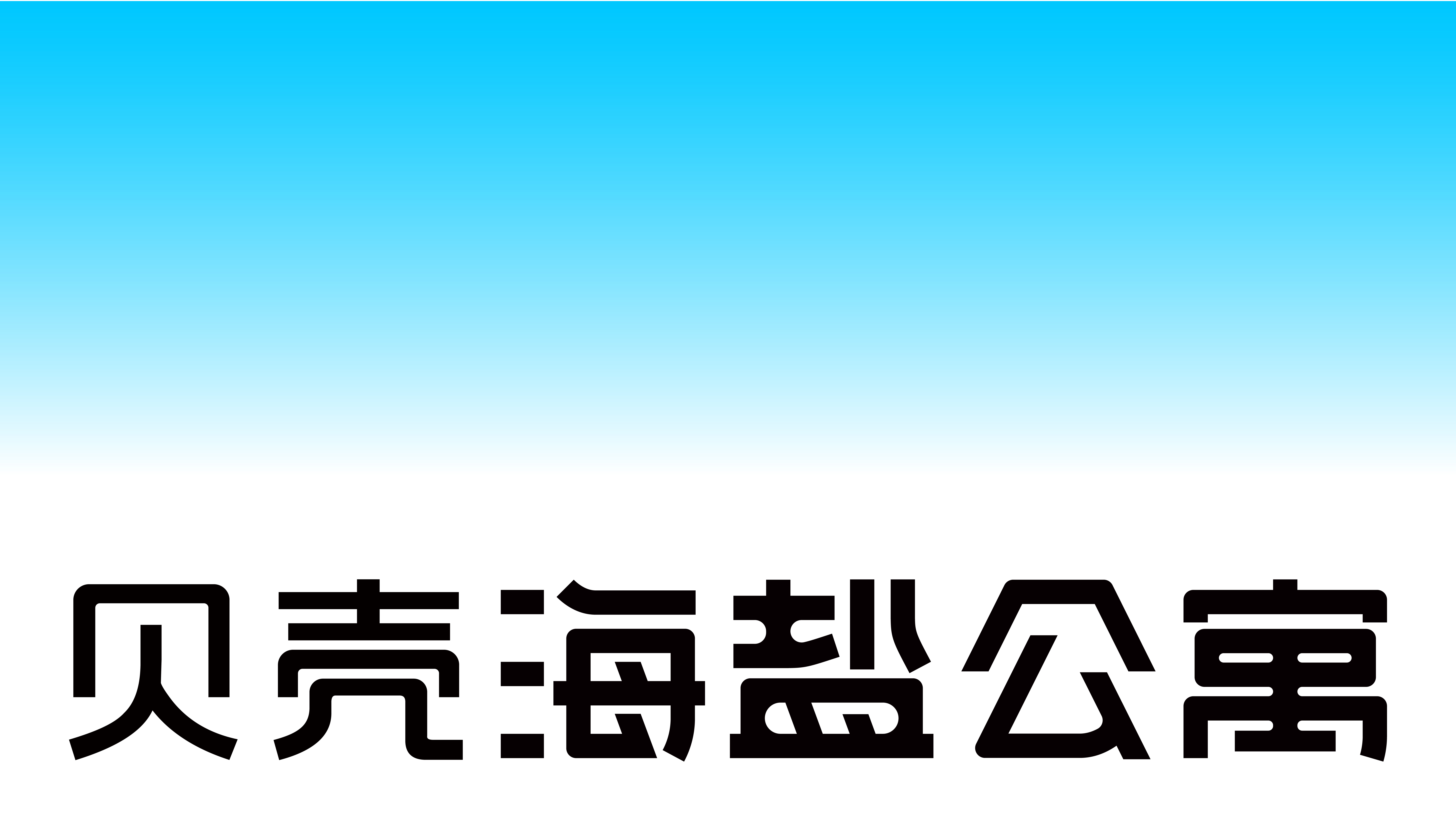
In its visual identity system, the logo takes the form of a vertically oriented rectangle with a gradient that transitions from blue to white from top to bottom. This gradient treatment reflects the brand’s commitment to balance and harmony, while the overall aesthetic is modern and minimalist.
The design is inspired by the idea of “sea salt,” evoking the beautiful imagery of pure white salt and the blue ocean. The whiteness of sea salt conveys freshness and purity, while the blue ocean suggests serenity and vastness, inviting people to return to their true selves and inspiring a sense of longing. Together, these elements symbolize the brand’s love of life and its aspiration for a better way of living.
From a broader perspective, the blue-to-white gradient recreates the natural relationship between sea salt and the ocean. Through this visual expression, we hope residents can also experience the beauty and calm of nature. Based on this visual logic, we developed a systematic design language across color, graphic elements, and imagery, seamlessly integrating this pure and uplifting brand symbol into the overall brand experience. More than just a logo, it represents a lifestyle—one that brings a sense of nature, tranquility, and understated elegance to everyday living.
贝壳海盐公寓是贝壳找房旗下的高品质白领公寓 。
在视觉识别上,Logo图形是一个由上到下呈现从蓝色到白色的渐变矩形,渐变的形式体现了品牌对于平衡与和谐的执着追求,整体风格现代简洁。
设计灵感源于“海盐”,由此畅想出白色海盐与蓝色海洋的美好景象。纯白的海盐,清新纯纯洁,蓝色的海洋,宁静广袤,让人回归本真、心生向往,象征着品牌对生活的热爱与追求。 从上到下渐变的蓝白色彩,从宏观角度复刻了海盐与海的状态,我们希望让居住者也能感受到大自然的美妙和平静。
以此为视觉逻辑,我们从色彩、辅助图形、图像语言等多个方面进行了系统规划,将纯洁美好的“品牌符号”自然融入到品牌体验中,它不仅仅是一个符号,更是品牌生活方式的象征,给人们带来一种自然、宁静、优雅的生活感受。