
Yakafu亚卡芙品牌形象升级
TEAMCD:彈簧SD:木村D:大桥、阿哲S/AE:马里布YEAR:2024CLIENT:亚卡芙SERVICE:品牌年度管理、品牌升级
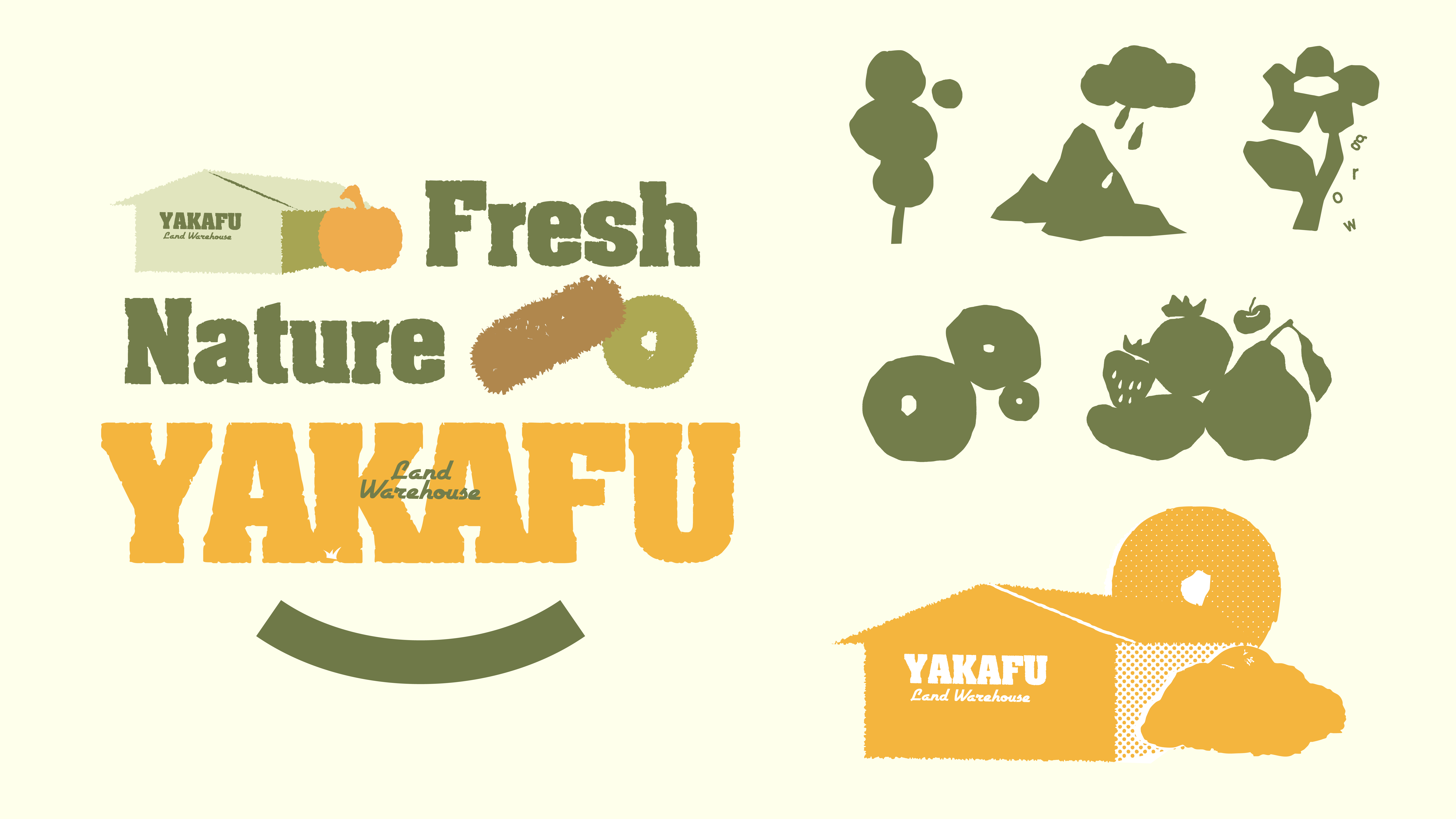
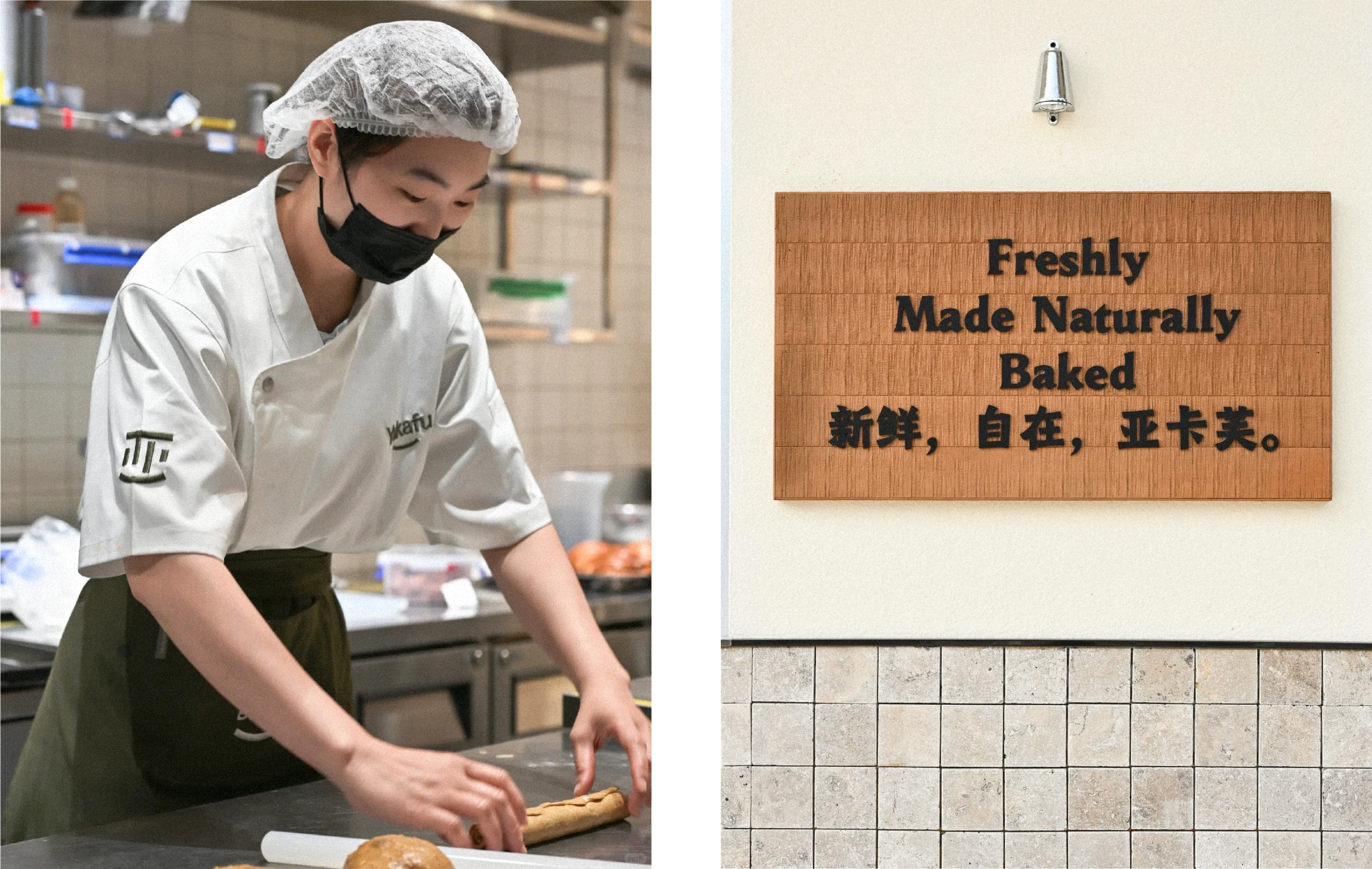
Yakafu 3.0 marks a new chapter for the brand, with “Freshness, Naturally” at its core, redefining both its brand strategy and visual identity.
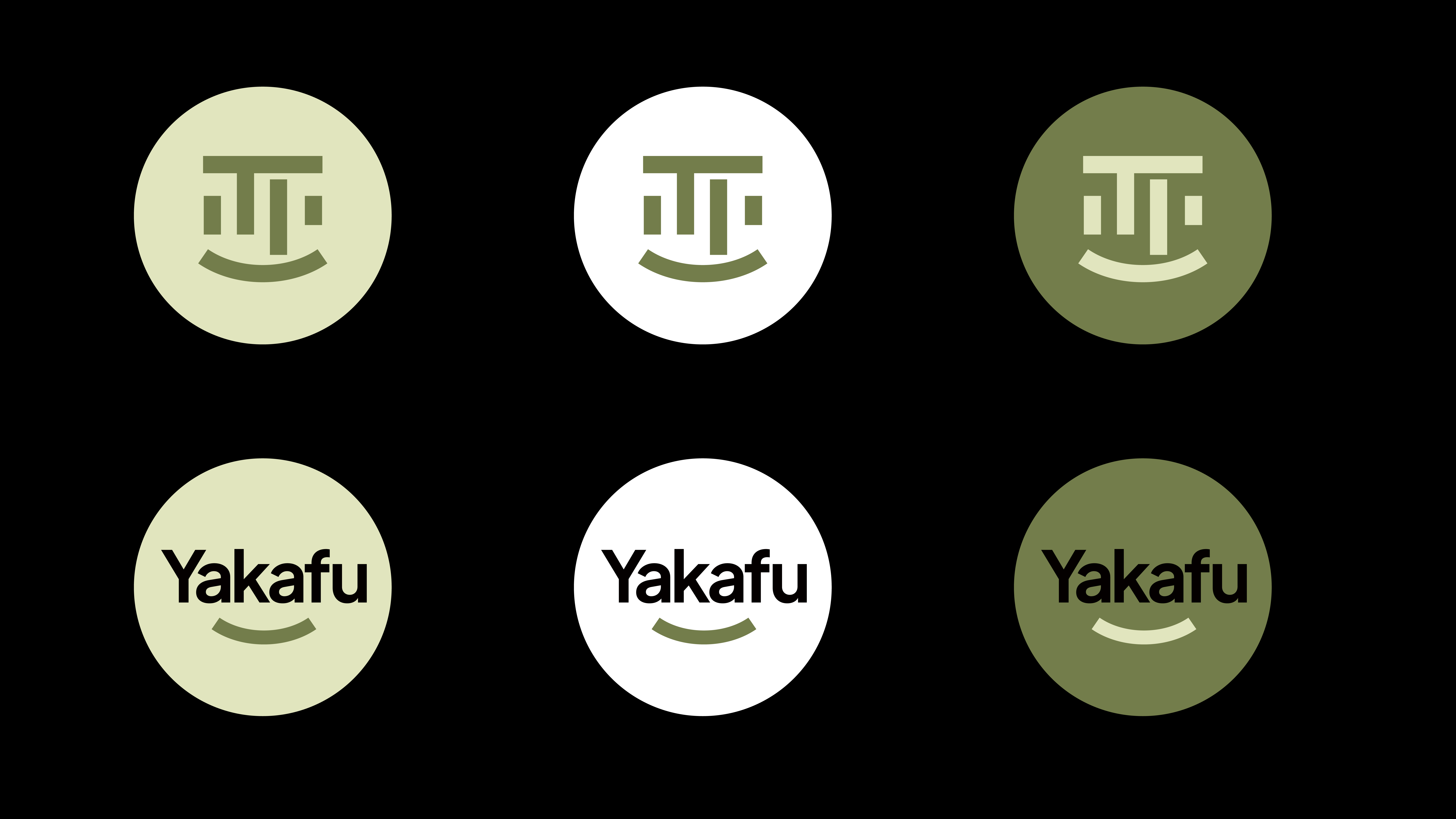
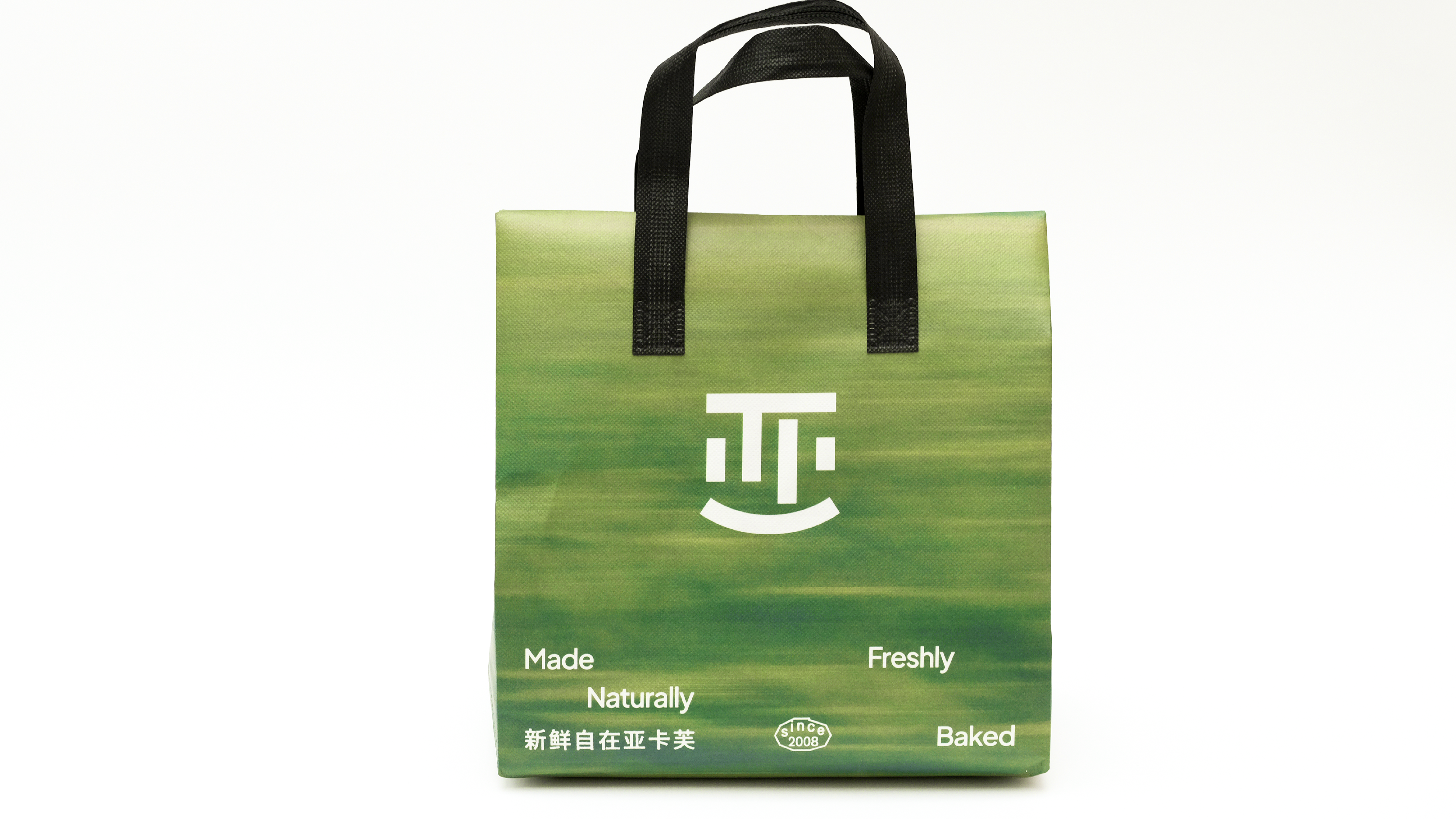
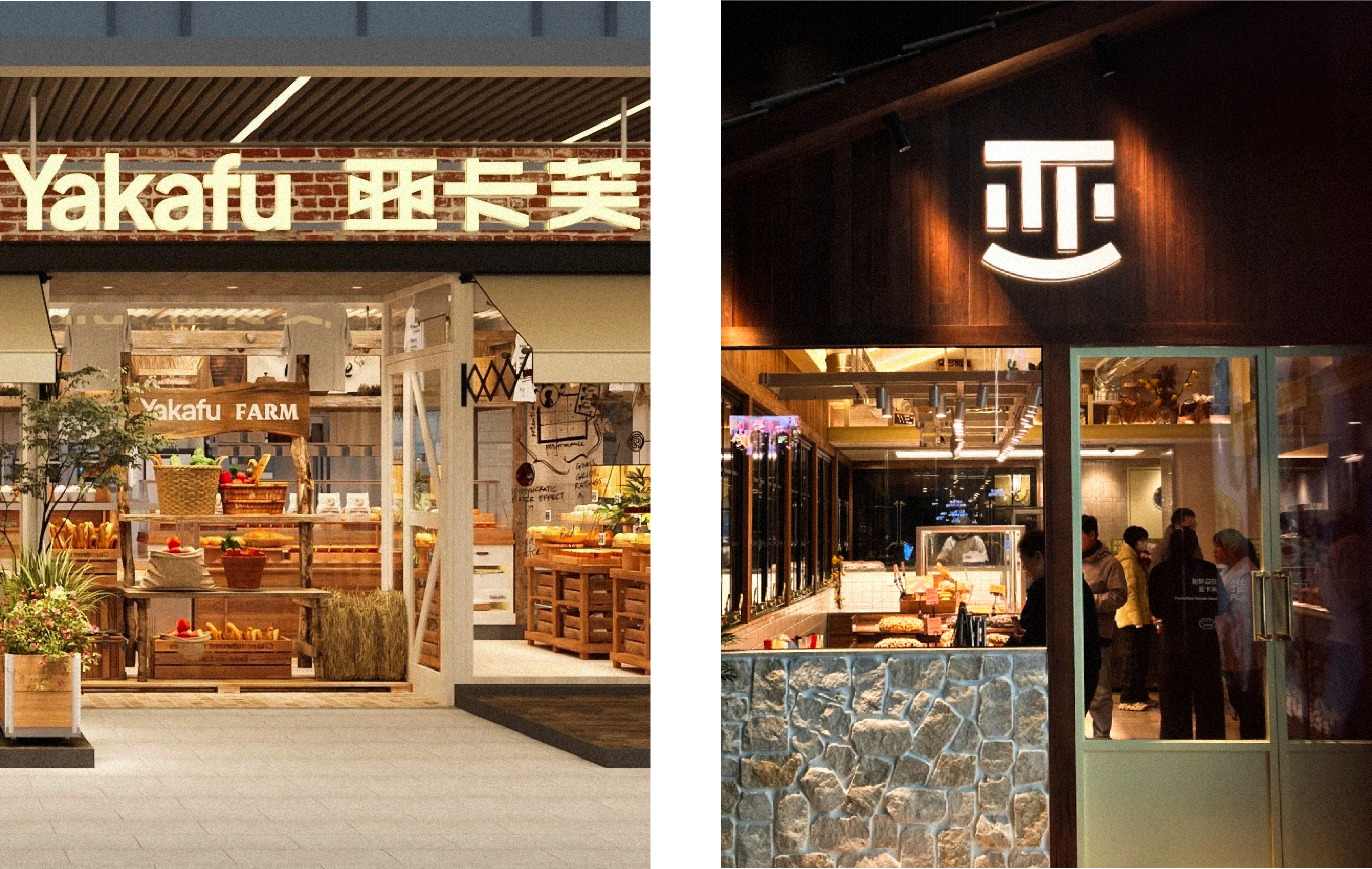
The Chinese character “亚” has long been a distinctive visual asset of Yakafu. Rather than replacing this familiar symbol, we chose to preserve it while giving it a new emotional expression.
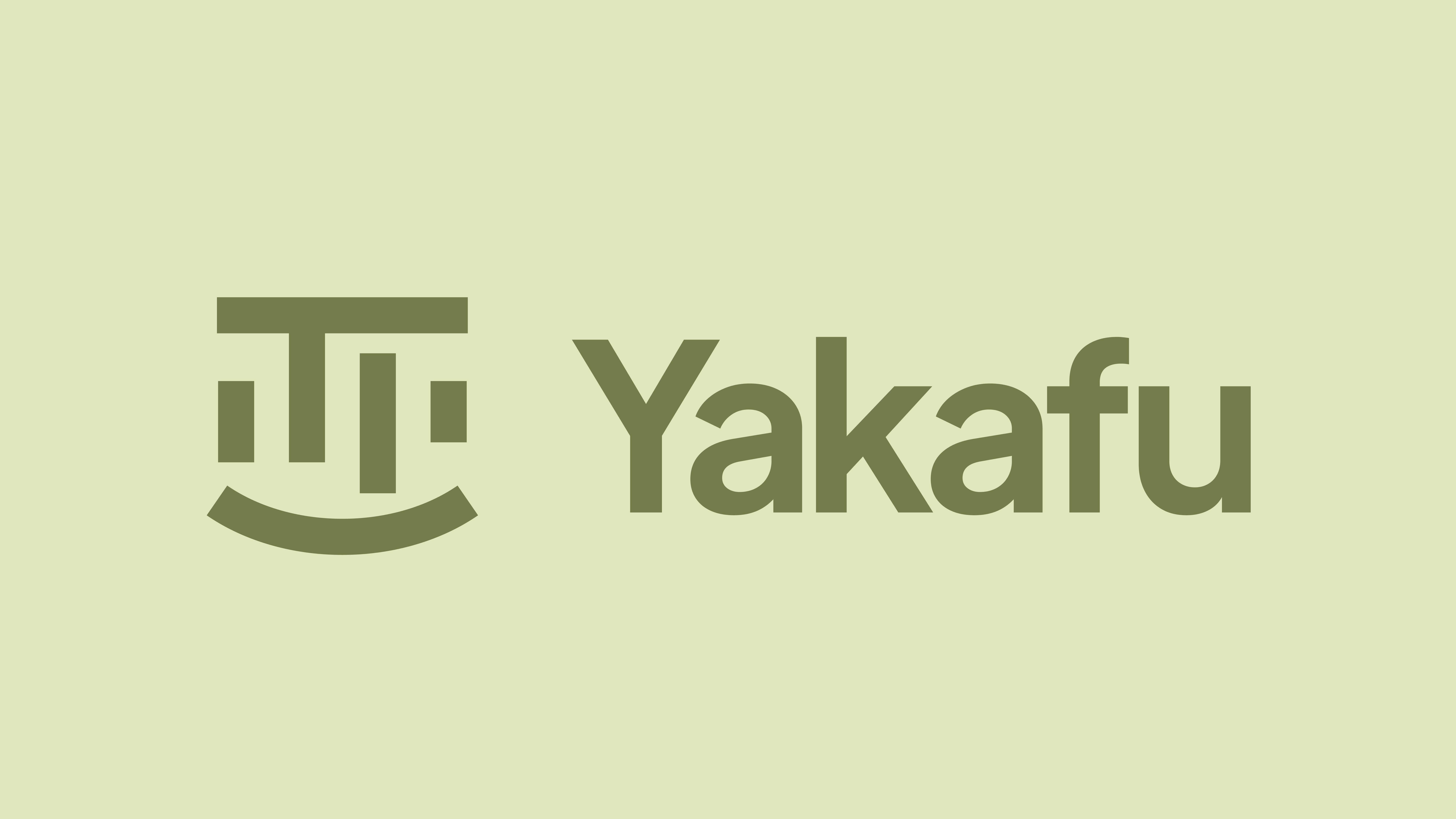
Inspired by the character’s unique symmetrical structure, we transformed its final horizontal stroke into a gently upturned curve—resembling a natural smile. A subtle change gives the familiar “亚” a fresh expression, making the brand feel warmer, more approachable, and more relaxed.
The Chinese character “亚” has long been a distinctive visual asset of Yakafu. Rather than replacing this familiar symbol, we chose to preserve it while giving it a new emotional expression.
Inspired by the character’s unique symmetrical structure, we transformed its final horizontal stroke into a gently upturned curve—resembling a natural smile. A subtle change gives the familiar “亚” a fresh expression, making the brand feel warmer, more approachable, and more relaxed.
亚卡芙3.0品牌升级,以“新鲜自在”为核心价值,重新梳理品牌战略与视觉体系。 “亚”字,是品牌长期积累的重要视觉资产。我们选择保留这份熟悉的记忆,并赋予它新的情绪表达。
基于“亚”字独特的对称结构,我们将最后一横转化为两端上扬的曲线,如同一个自然的微笑。 一个细微的变化,让熟悉的“亚”字有了新的表情,也让品牌更亲和、更轻松、更具温度。
基于“亚”字独特的对称结构,我们将最后一横转化为两端上扬的曲线,如同一个自然的微笑。 一个细微的变化,让熟悉的“亚”字有了新的表情,也让品牌更亲和、更轻松、更具温度。