
Coda Bus小马可达
TEAMCD:彈簧SD:木村D:大桥、李维康Illustrator:永浩S:王二、马里布YEAR:2019CLIENT: 云南大理交通运输集团公司SERVICE:品牌形象
Coda Bus is an inter-county public transit brand developed by Dali Transportation Group. By adopting a bus-oriented operating model, it reduces travel costs while providing passengers with safer, more convenient, and more affordable transportation.
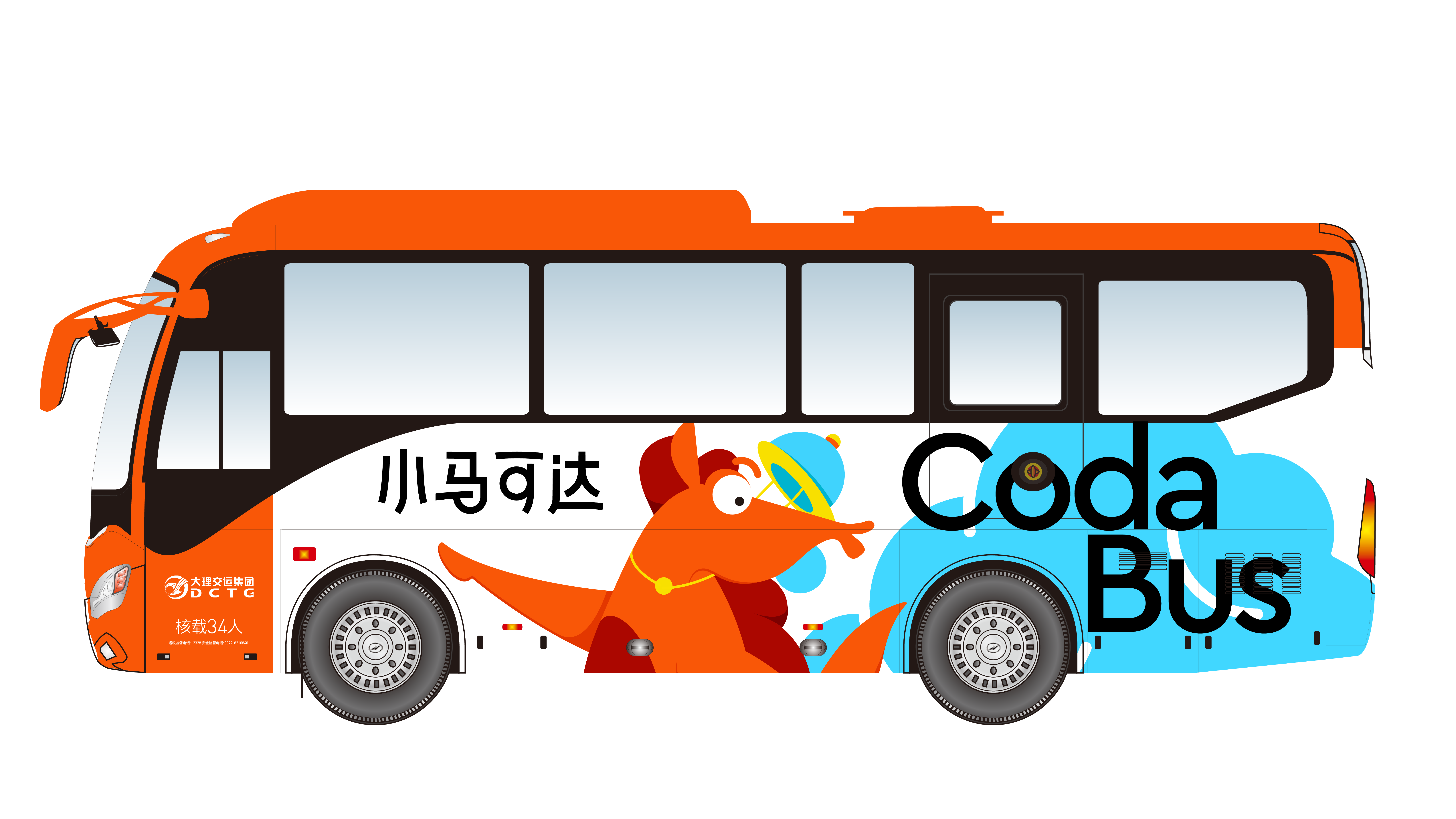
The fleet is composed entirely of electric buses, supporting sustainable mobility through low-carbon transportation. A unified vehicle identity, standardized service, and consistent operating system establish a professional and trustworthy brand, enabling passengers to instantly recognize and rely on Coda Bus for every journey.
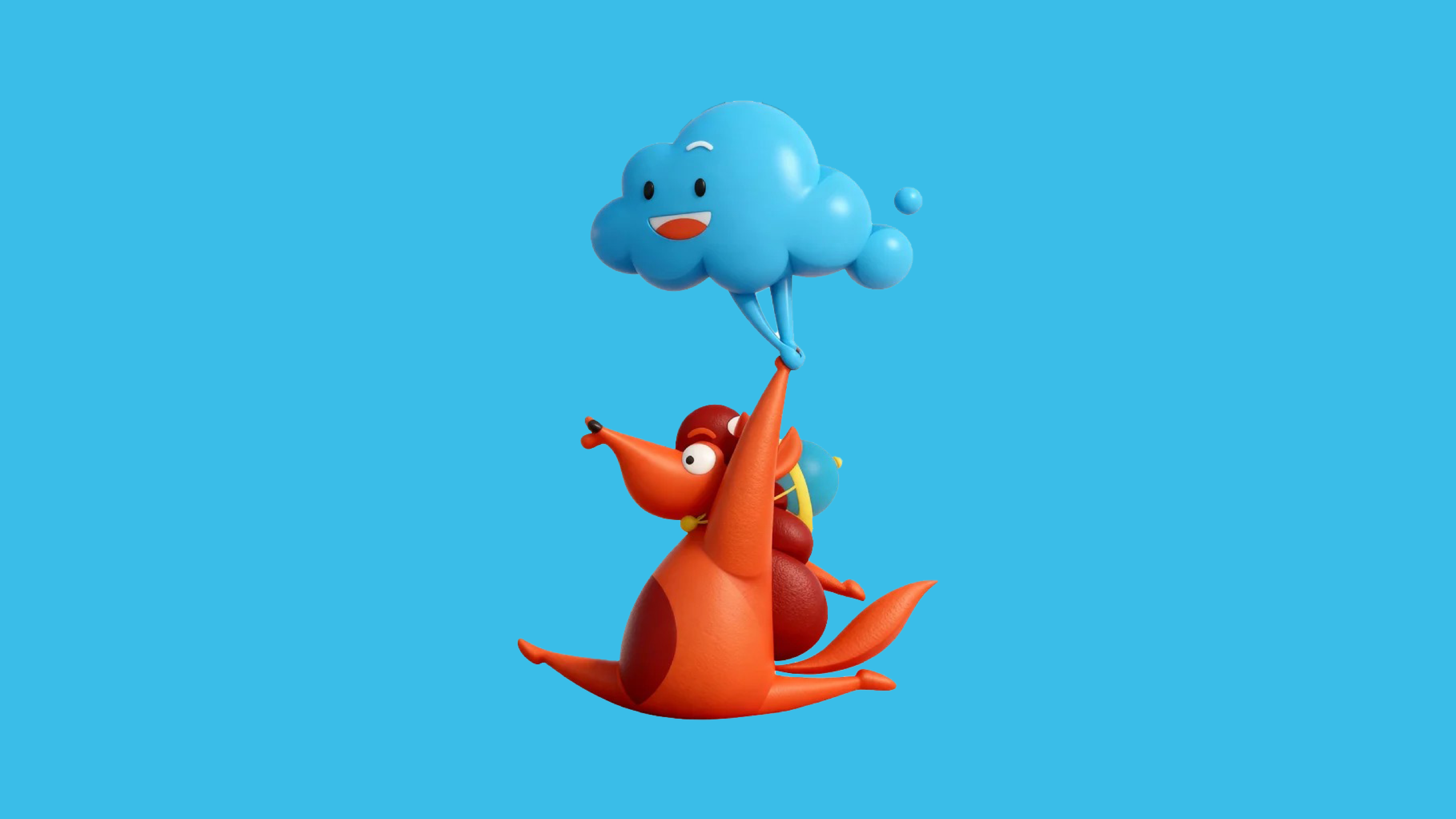
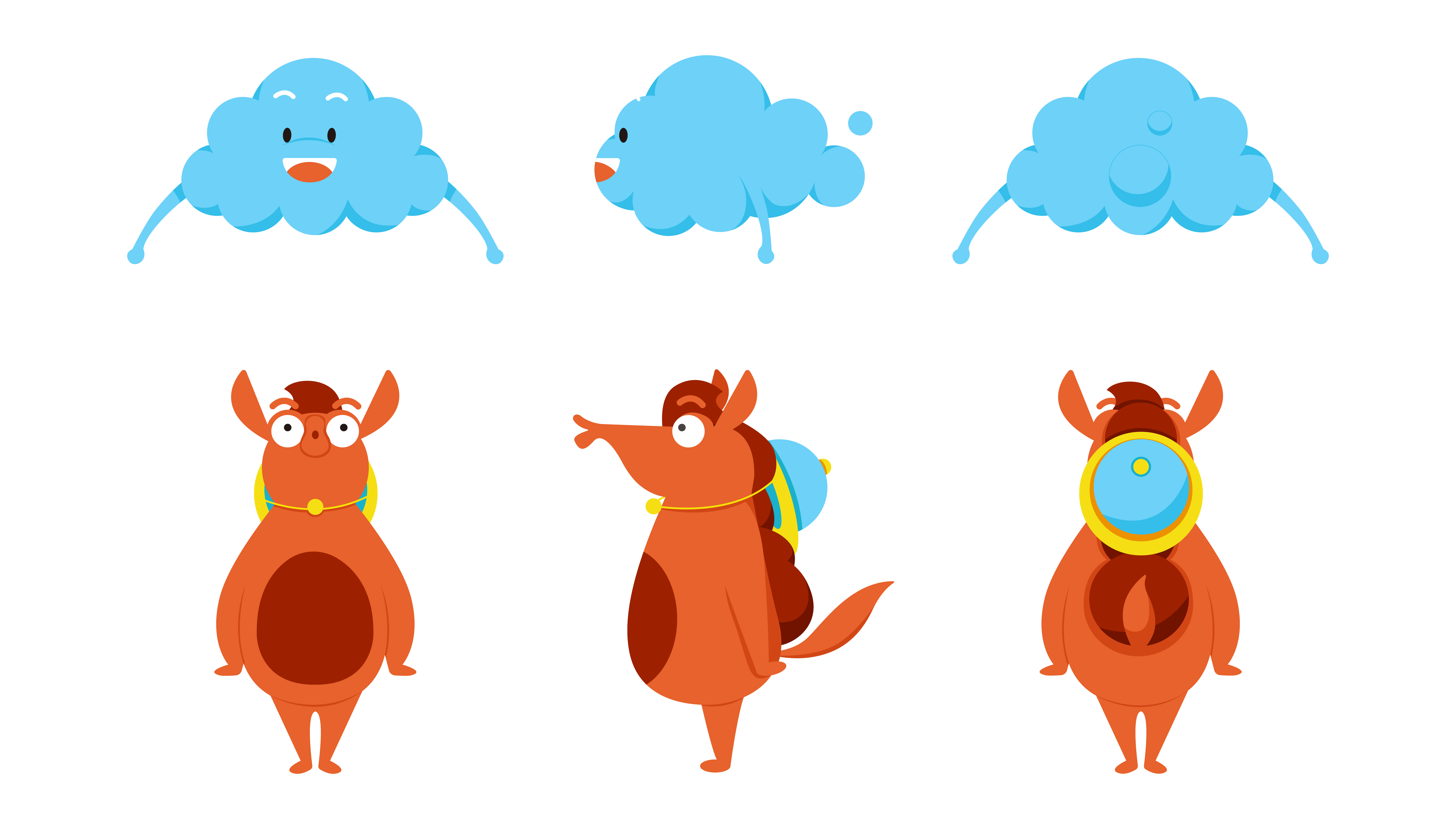
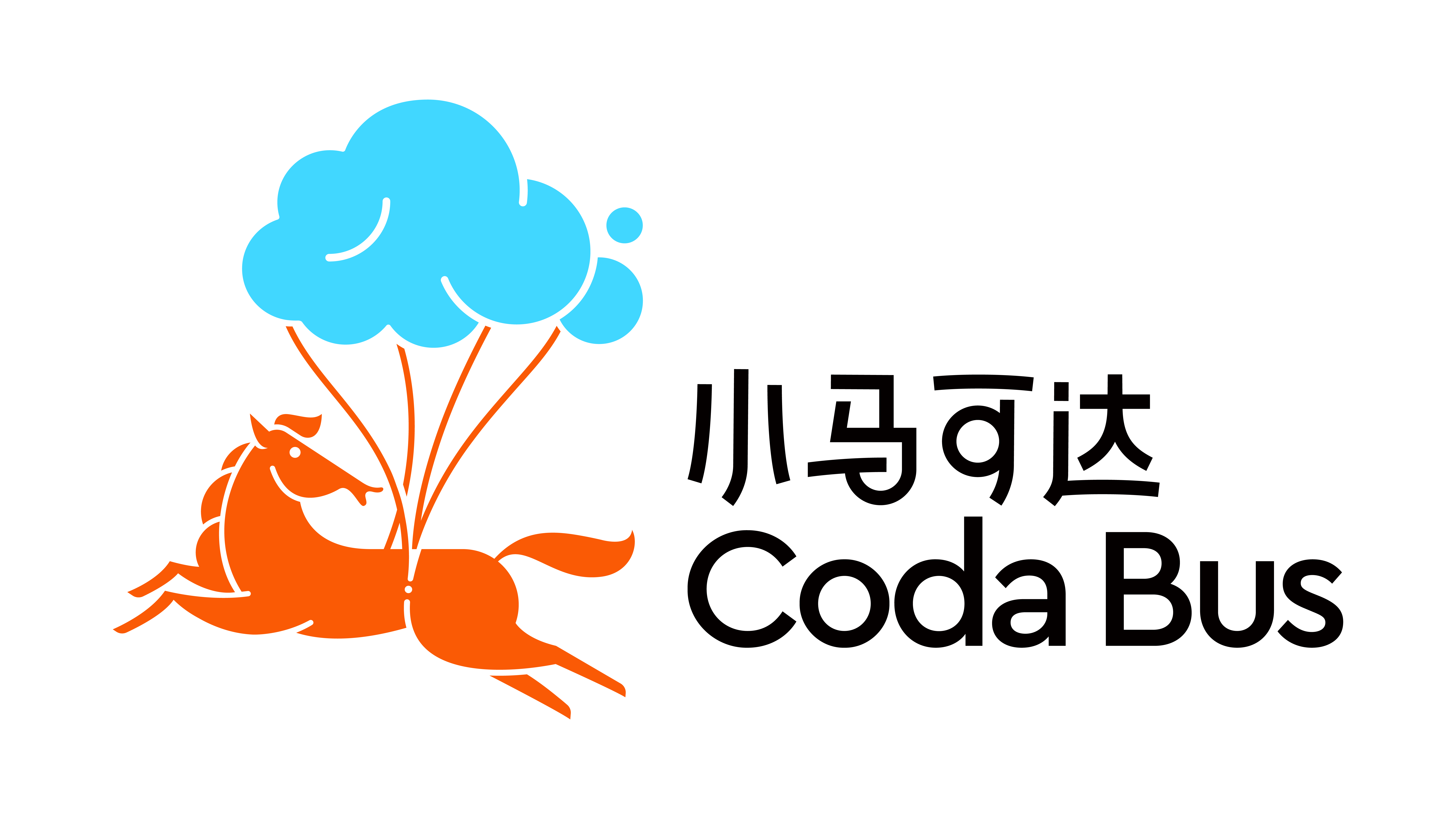
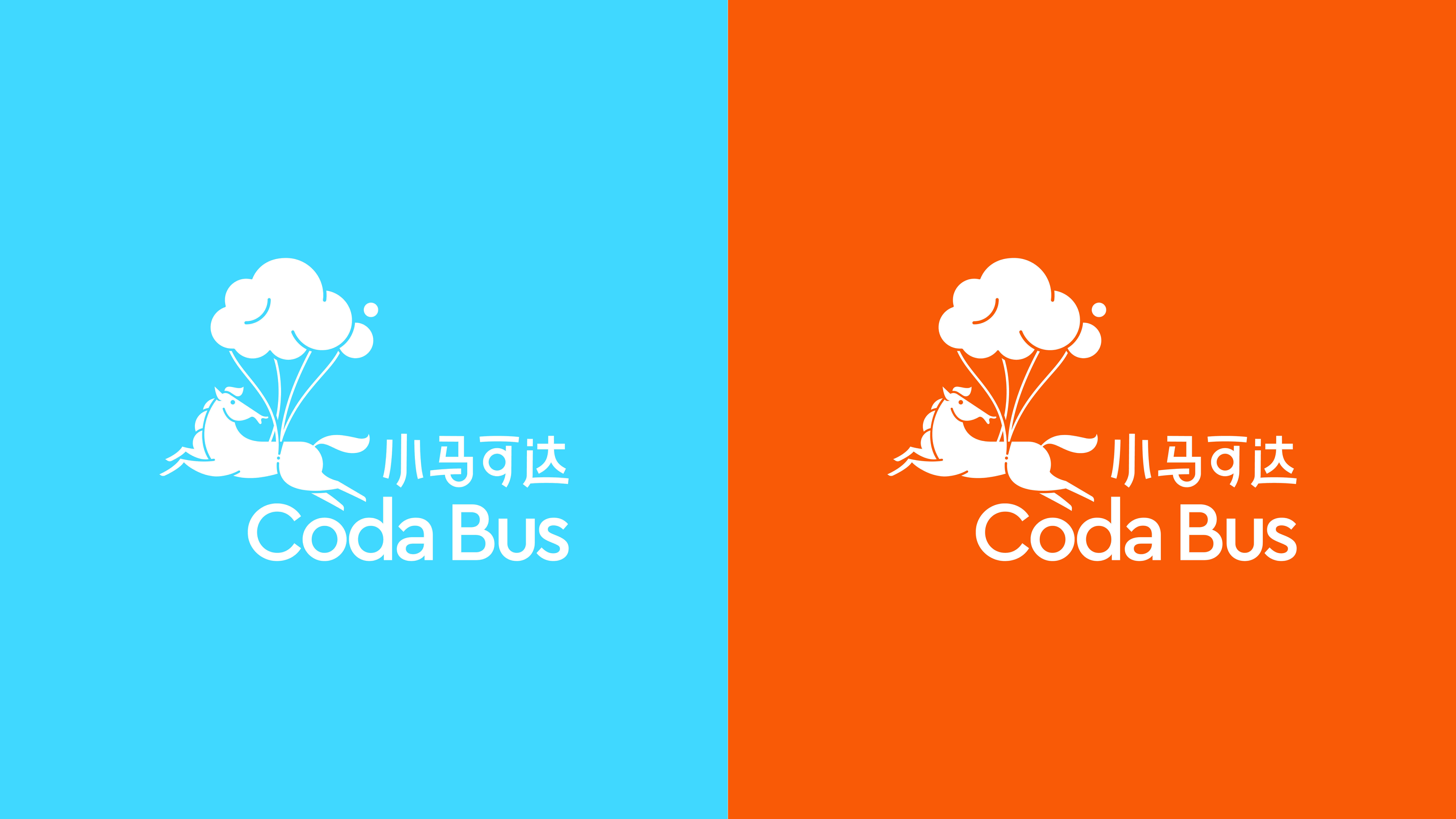
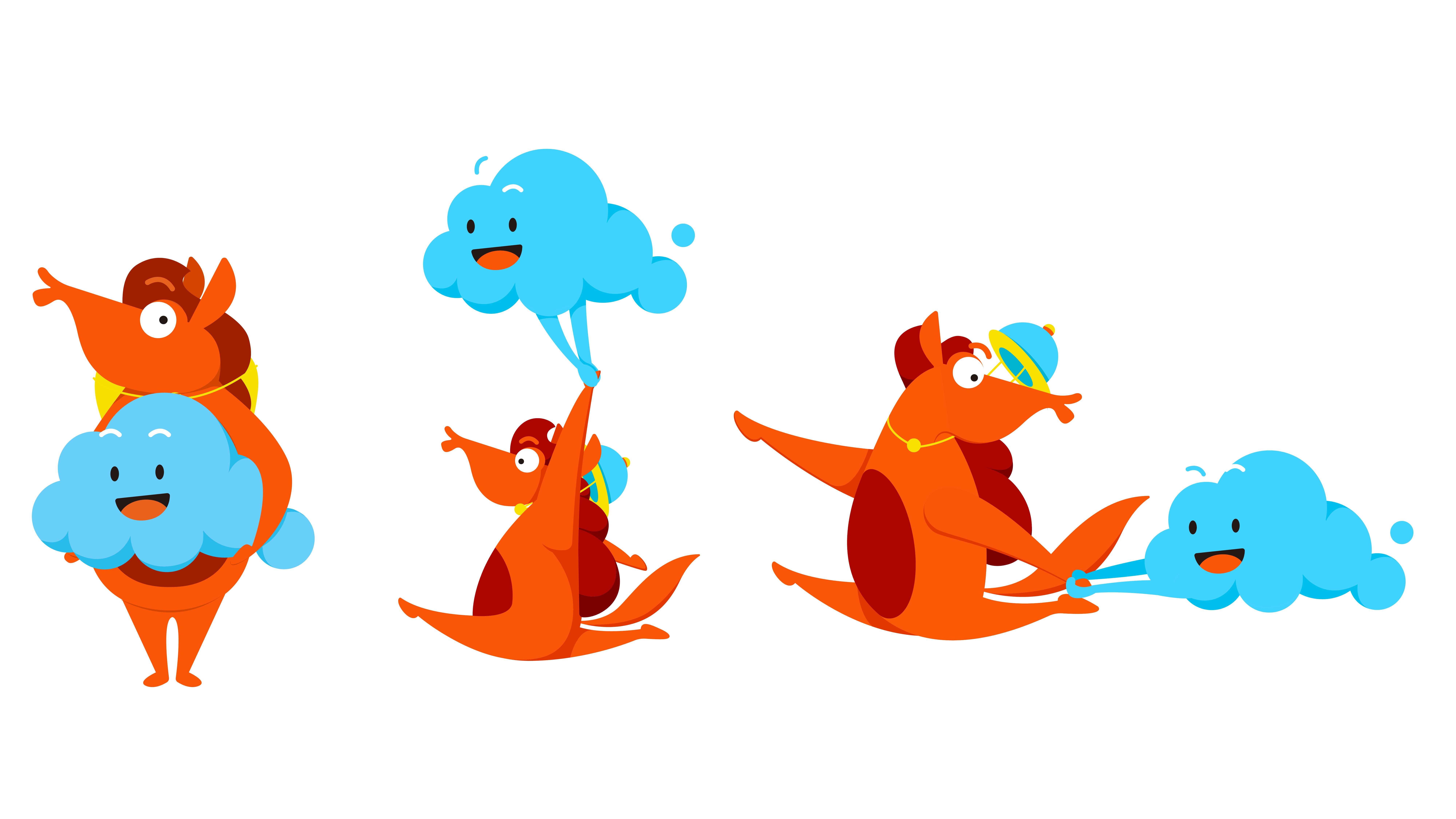
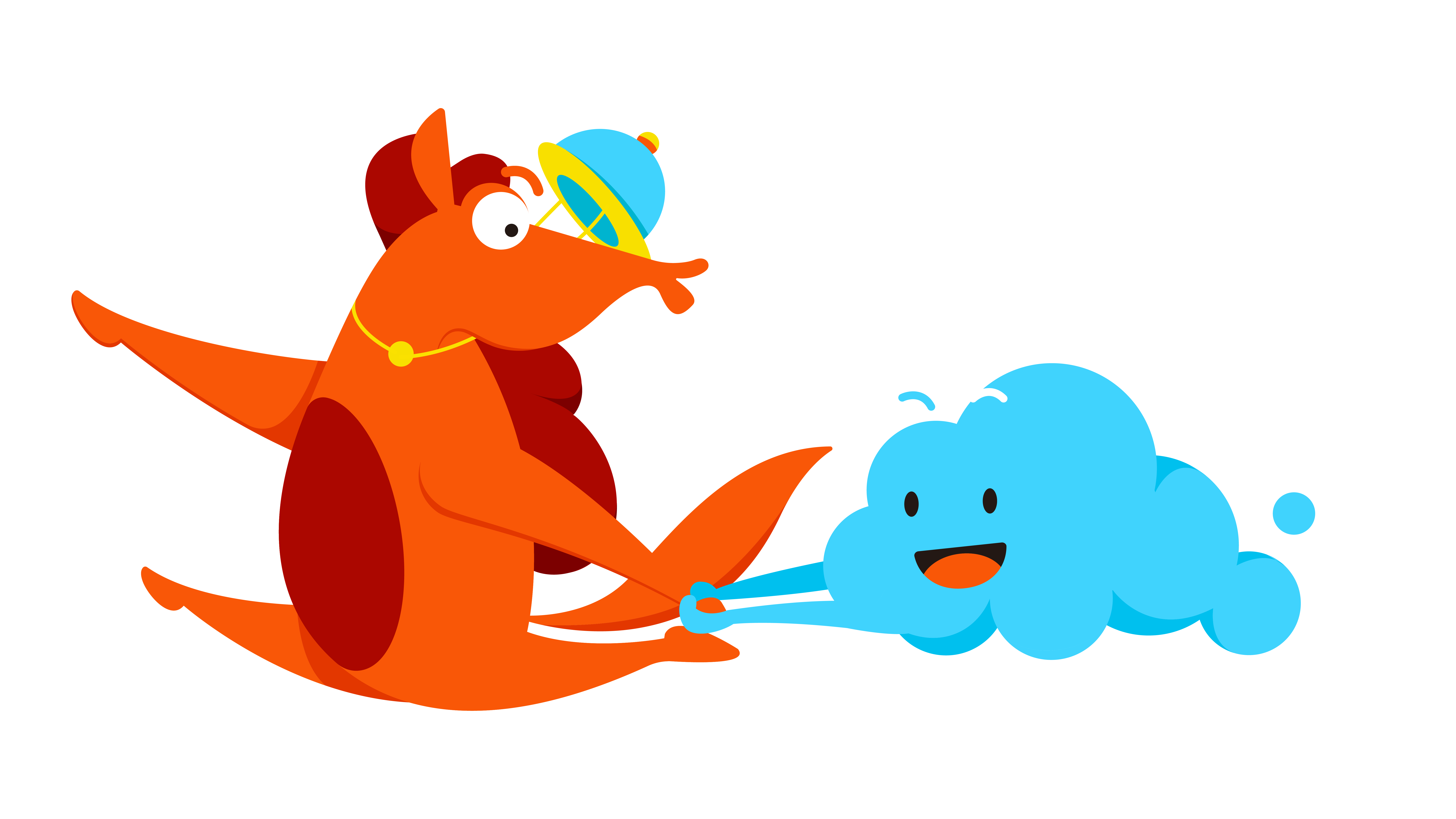
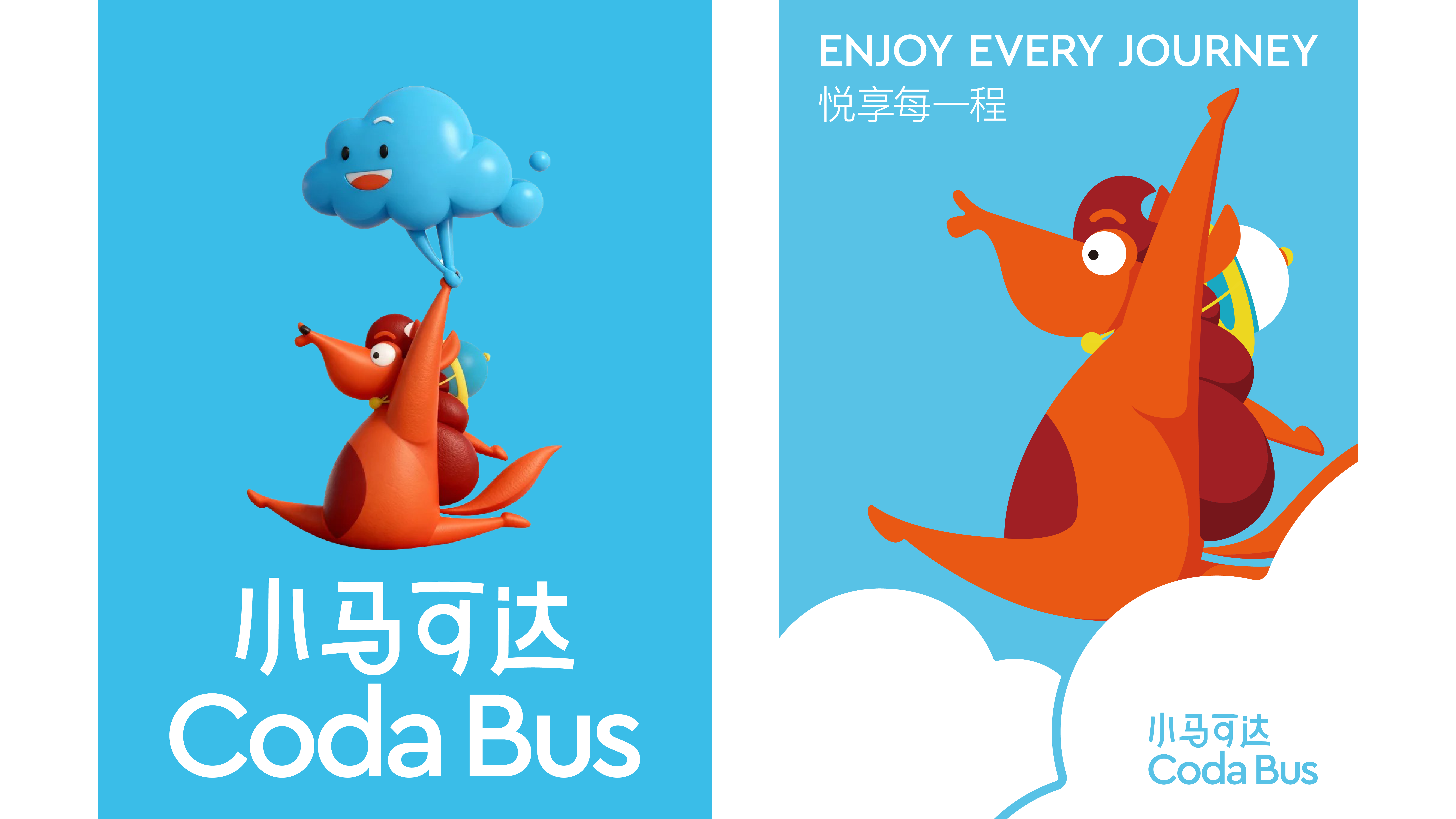
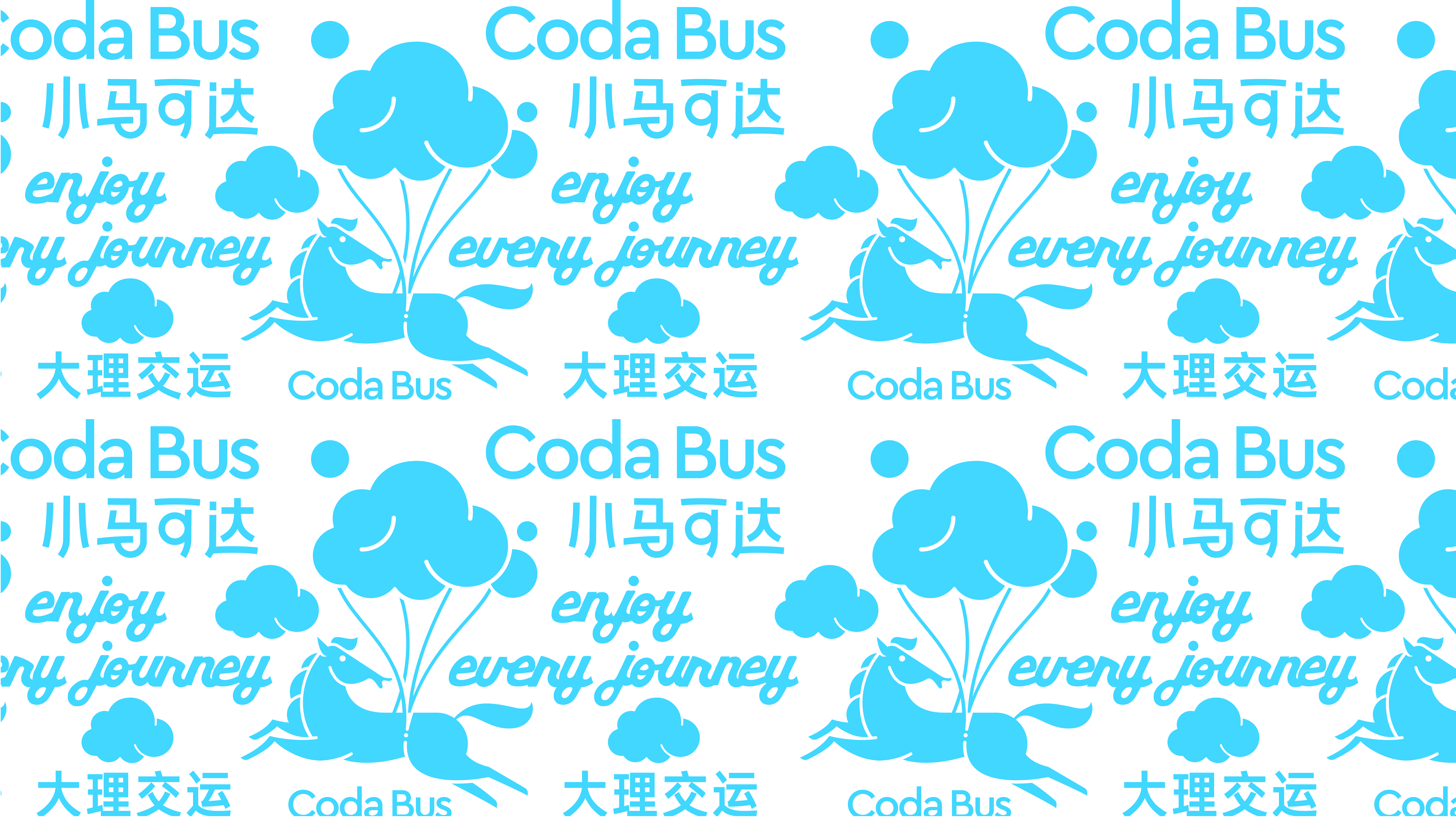
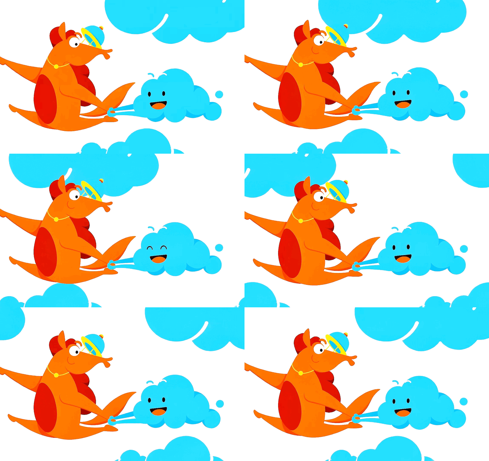
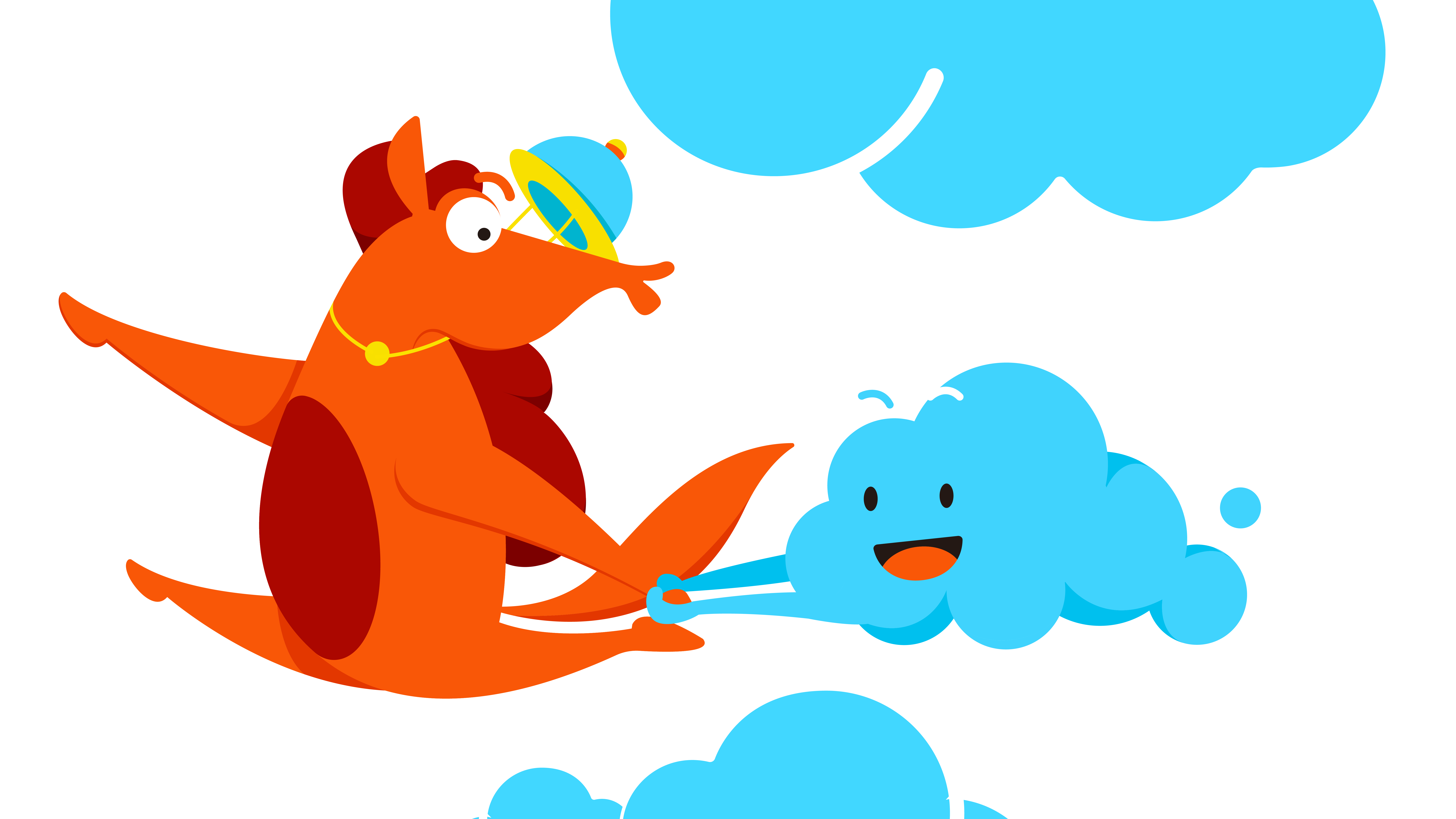
The visual identity is built around the combination of a horse and cloud, expressing lightness, agility, and forward movement. The horse is depicted in a dynamic leaping pose, while its playfully puckered lips subtly reference a vehicle horn, creating a highly distinctive mascot. Floating clouds enhance the sense of effortless motion and reflect Dali's iconic blue skies.
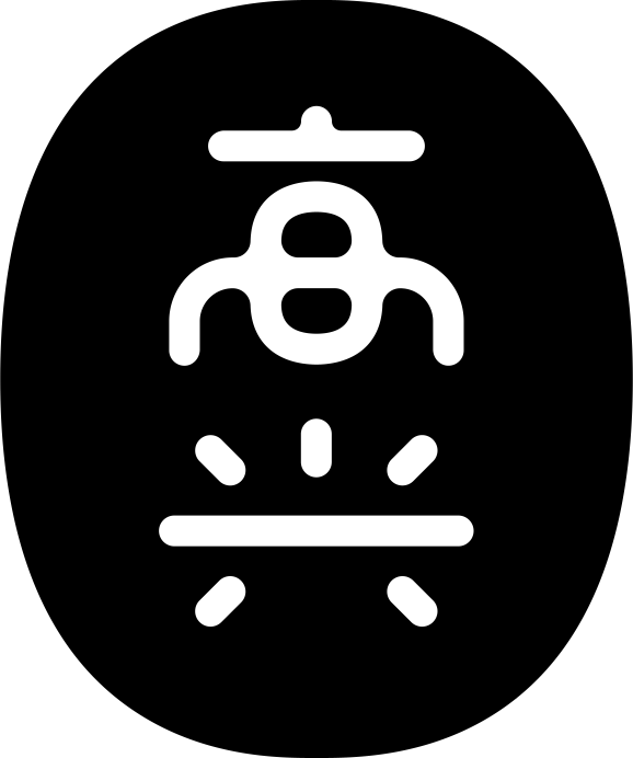
The logotype extends the visual language with soft, rounded strokes, creating a warm and approachable character. Together, the symbol and typography form a cohesive identity system, delivering a clear, memorable, and recognizable brand image.
The fleet is composed entirely of electric buses, supporting sustainable mobility through low-carbon transportation. A unified vehicle identity, standardized service, and consistent operating system establish a professional and trustworthy brand, enabling passengers to instantly recognize and rely on Coda Bus for every journey.
The visual identity is built around the combination of a horse and cloud, expressing lightness, agility, and forward movement. The horse is depicted in a dynamic leaping pose, while its playfully puckered lips subtly reference a vehicle horn, creating a highly distinctive mascot. Floating clouds enhance the sense of effortless motion and reflect Dali's iconic blue skies.
The logotype extends the visual language with soft, rounded strokes, creating a warm and approachable character. Together, the symbol and typography form a cohesive identity system, delivering a clear, memorable, and recognizable brand image.
小马可达 Coda Bus是大理交通运输集团打造的县际公交品牌,通过公交化运营模式降低出行成本,让更多乘客以更亲民的价格享受安全、便捷的交通服务。
车辆全部采用纯电动客车,以绿色低碳理念推动县际交通升级,并通过统一的车辆形象、服务标准与运营模式,建立专业、可信赖的品牌认知,让乘客一眼识别,悦享每一程。
视觉形象以“马”与“云”为核心元素,塑造轻盈、灵动的品牌气质。跃起的小马充满动感与张力,微微嘟起的嘴唇巧妙呼应车辆喇叭,使形象更具辨识度;漂浮的云朵则强化了腾跃感,也映射出大理蓝天白云的地域特色。
字体设计延续图形语言,采用柔和圆润的线条,营造亲切、友好的品牌感受。图形与文字相互呼应,共同构建统一鲜明、易于识别的品牌视觉形象。
车辆全部采用纯电动客车,以绿色低碳理念推动县际交通升级,并通过统一的车辆形象、服务标准与运营模式,建立专业、可信赖的品牌认知,让乘客一眼识别,悦享每一程。
视觉形象以“马”与“云”为核心元素,塑造轻盈、灵动的品牌气质。跃起的小马充满动感与张力,微微嘟起的嘴唇巧妙呼应车辆喇叭,使形象更具辨识度;漂浮的云朵则强化了腾跃感,也映射出大理蓝天白云的地域特色。
字体设计延续图形语言,采用柔和圆润的线条,营造亲切、友好的品牌感受。图形与文字相互呼应,共同构建统一鲜明、易于识别的品牌视觉形象。