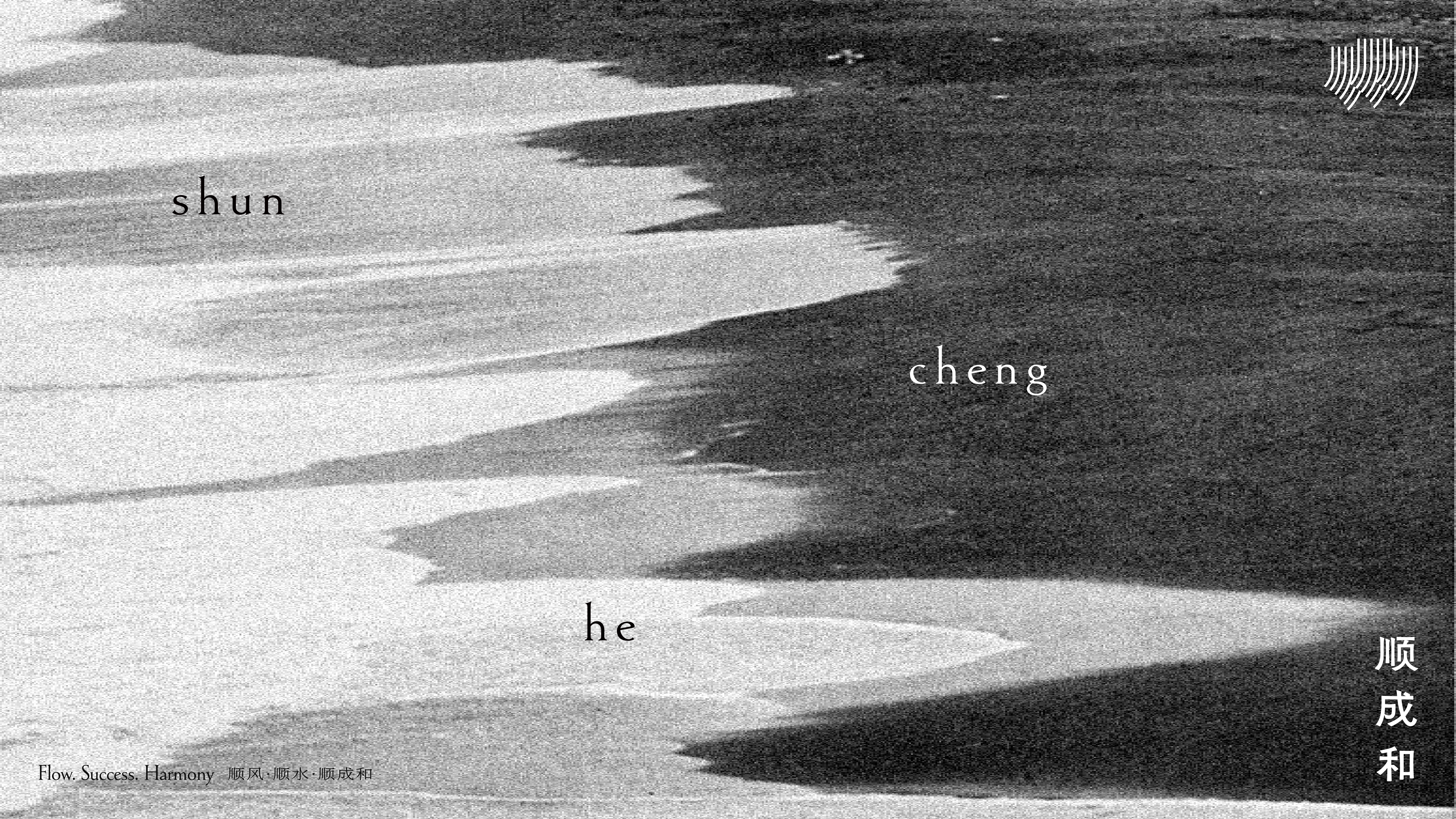
shunchenghe顺成和
TEAMCD:弹簧SD:木村D:大桥、梅有动态:万蓬S/AE:王二YEAR:2026CLIENT:顺成和SERVICE:品牌形象
Flow.Success.Harmony — Shunchenghe
“Shunchenghe” embodies a philosophy rooted in Eastern brewing wisdom:
to follow nature, to realize terroir, and to harmonize with all living systems.
This concept transcends geography and becomes the spiritual core and value proposition of the brand.
The visual renewal is built upon the central narrative of “Flow.Success.Harmony • Shunchenghe.”
It draws from the rhythm of Eastern nature while expressing the refined aesthetics of international brewing.
Rooted in tradition, beautiful in the modern era;grounded in local culture, brewing the future.
The overall visual language is anchored in the brand’s philosophical foundation.Through restrained expression and rational design logic, the system employs expansive natural whitespace and modernist typography to construct a profound sense of sophistication and quiet luxury.
The visual system is grounded in a palette of pure black, white, and grey. This achromatic foundation enables a highly neutral and universal expression, allowing the brand to communicate with clarity, calmness, and timeless elegance.
The mark draws inspiration from the natural movements of wind and water beneath the vast sky, directly echoing the brand ethos of“Flow.Success.Harmony • Shunchenghe.”
Moments such as a gentle breeze brushing across nature and ripples spreading across water are abstracted into a system of minimal linear forms that balance order and fluidity.
顺风顺水,顺成和
“顺成和”三个字所蕴含的东方酿造哲学。顺应自然、成就风土、和合共生,已超越单一地理范畴,成为品牌的精神内核与价值主张。
本次视觉升级以「顺风•顺水•顺成和」为核心,融东方自然之韵,铸国际酿造之美。
源于传统,美在当代。 根植本土,酿造未来。
整体风格立意紧扣核心哲学,视觉表达呈现出克制与理性,通过大面积的自然留白与现代主义排版,构建出深邃的高级感。
在色彩系统的规划上,我们确立了以纯粹的黑、白、灰为视觉基底,这种无色彩系的运用旨在实现高度“中性”的表达。
标志图形的灵感汲取自苍穹之下“风” 与“水” 的自然律动 ,高度契合“顺风顺水顺成和”的品牌主张 。
“顺成和”三个字所蕴含的东方酿造哲学。顺应自然、成就风土、和合共生,已超越单一地理范畴,成为品牌的精神内核与价值主张。
本次视觉升级以「顺风•顺水•顺成和」为核心,融东方自然之韵,铸国际酿造之美。
源于传统,美在当代。 根植本土,酿造未来。
整体风格立意紧扣核心哲学,视觉表达呈现出克制与理性,通过大面积的自然留白与现代主义排版,构建出深邃的高级感。
在色彩系统的规划上,我们确立了以纯粹的黑、白、灰为视觉基底,这种无色彩系的运用旨在实现高度“中性”的表达。
标志图形的灵感汲取自苍穹之下“风” 与“水” 的自然律动 ,高度契合“顺风顺水顺成和”的品牌主张 。