WEI-LONG Apo He Stinky Tofu卫龙何阿婆臭豆腐系列包装设计
TeamCD:彈簧、殷九龙SD:木村D:大桥S:马里布YEAR:2026CLIENT: 卫龙SERVICE:包装设计
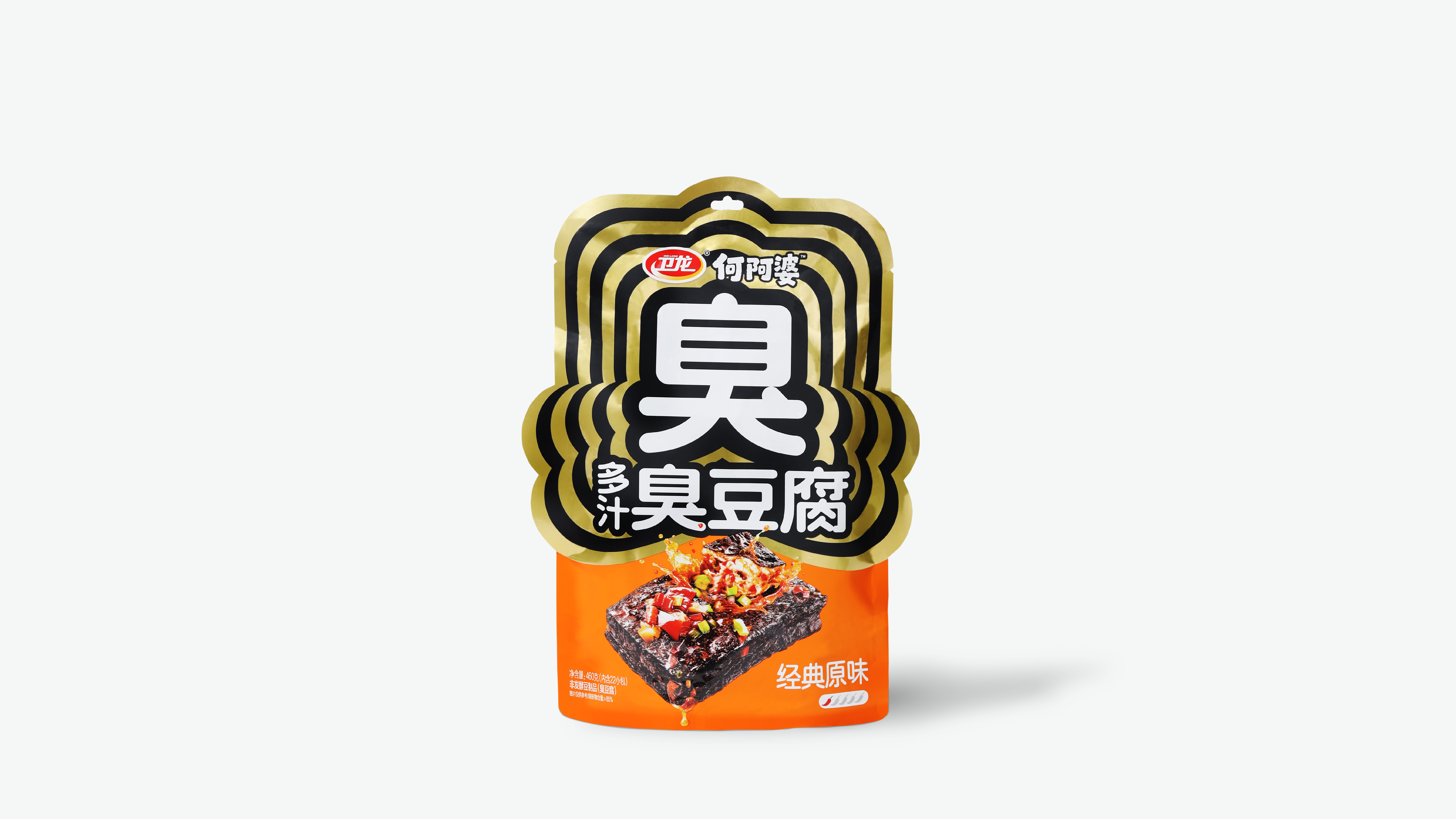
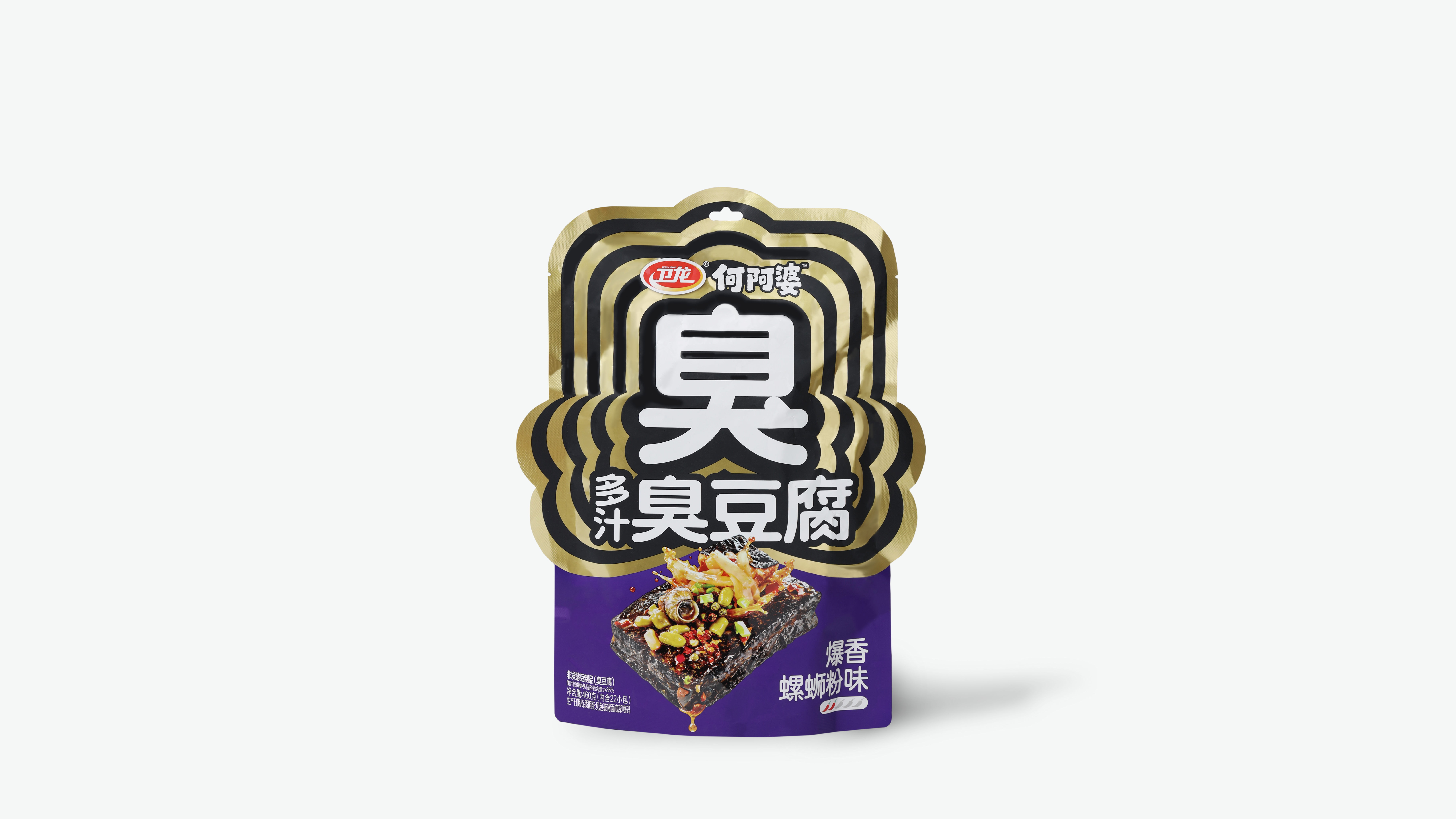
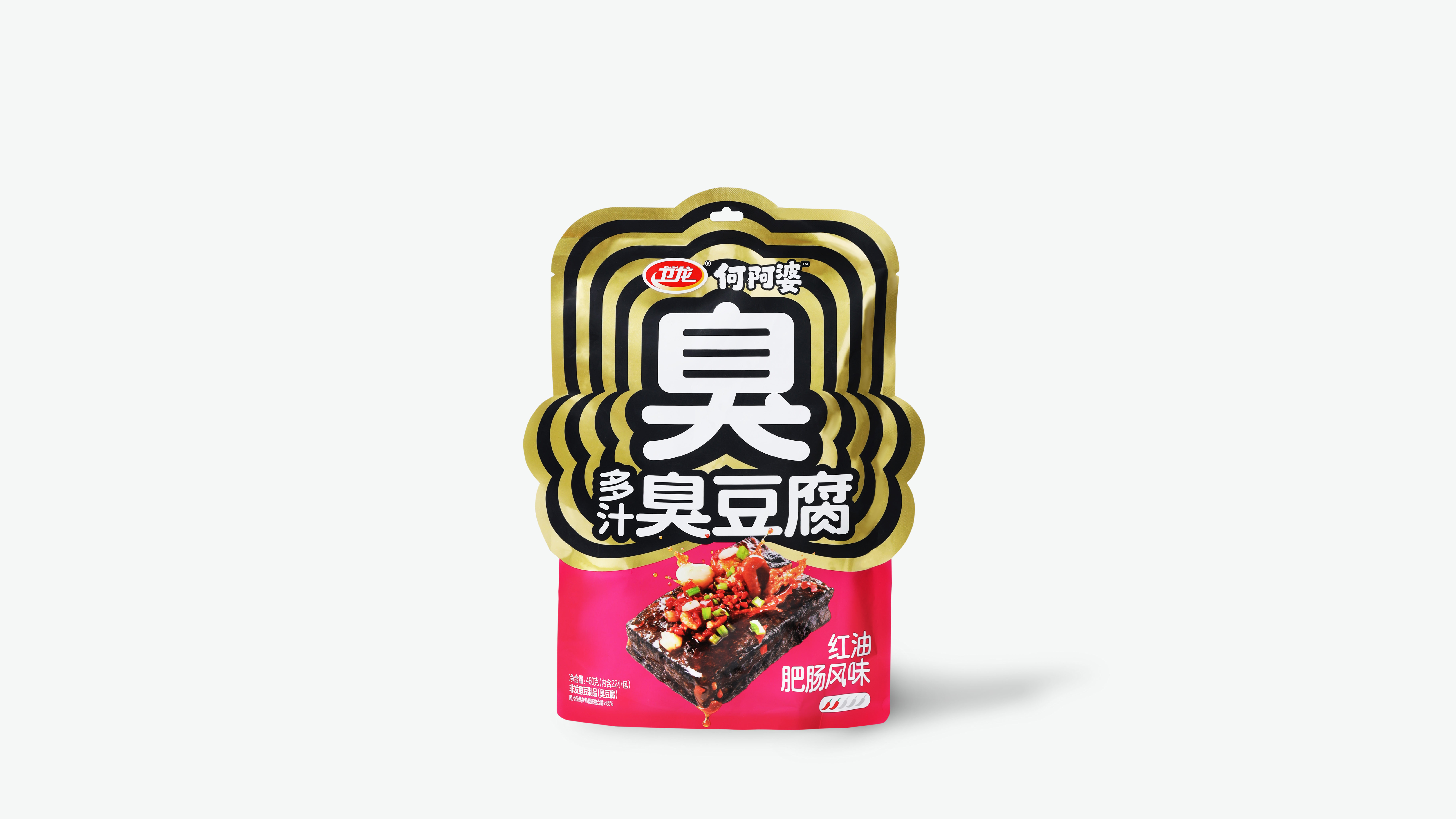
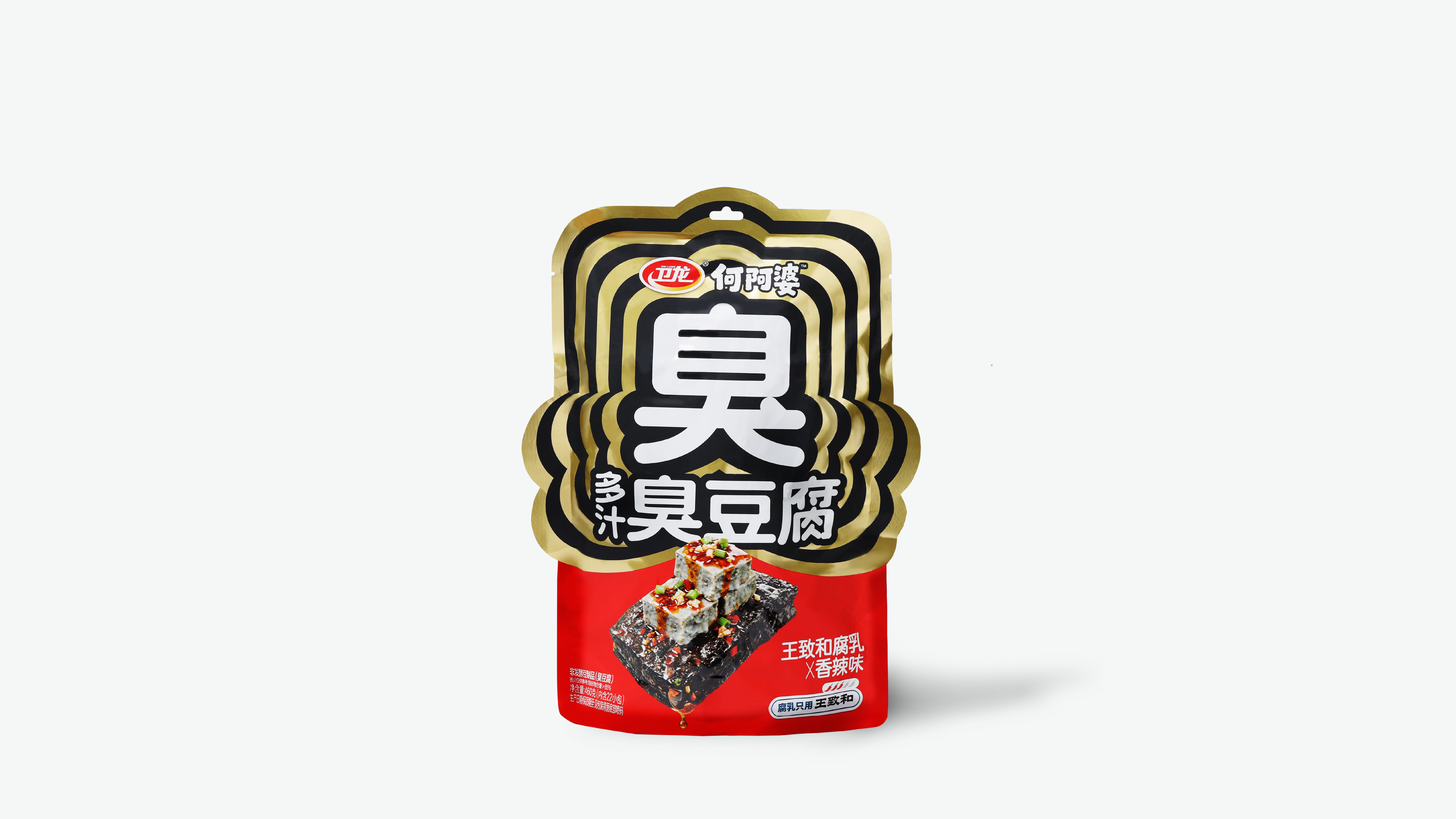
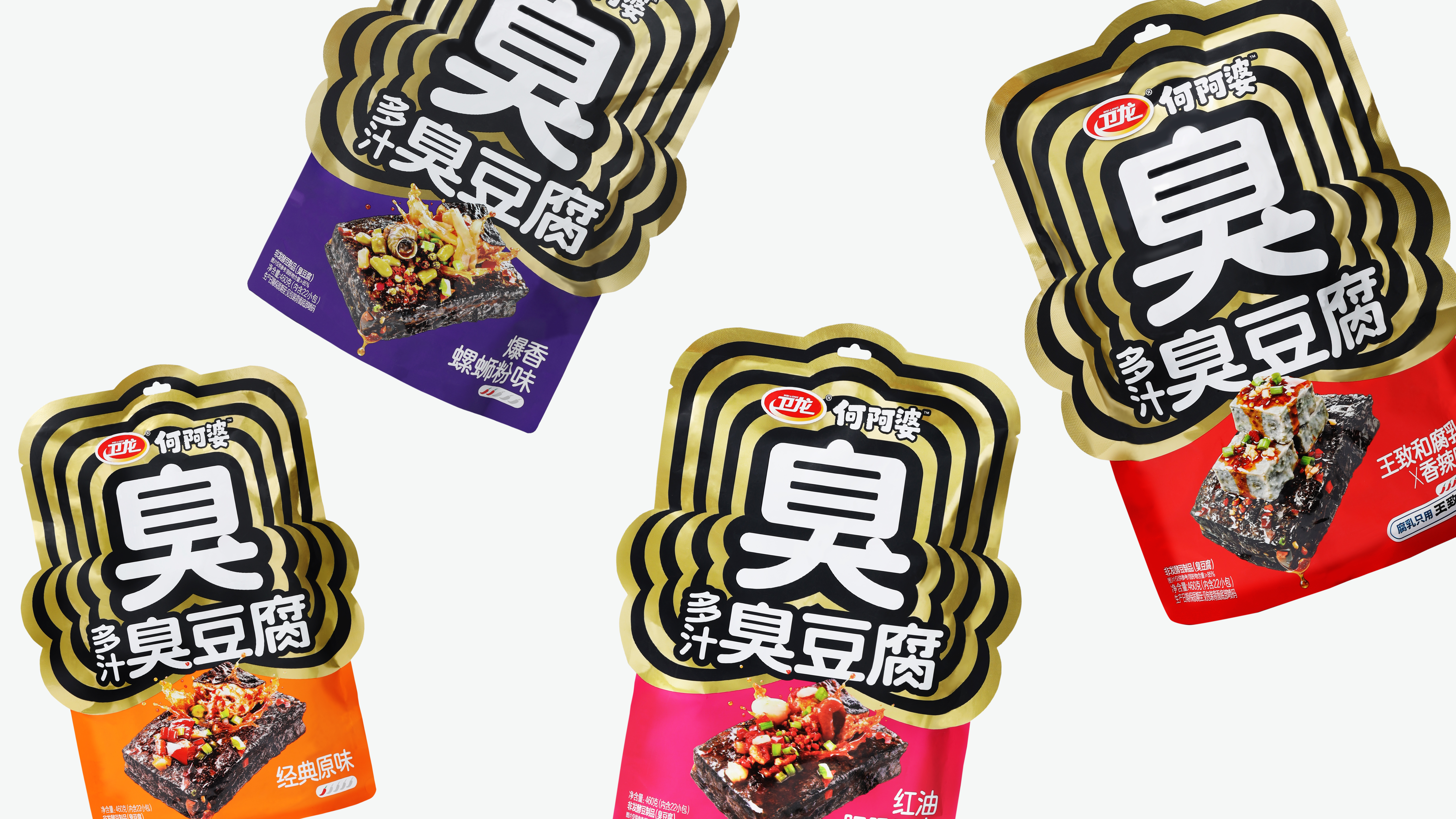
The character “臭” (chòu), meaning “stinky,” takes center stage in the packaging design. Surrounded by layers of radiating contour lines, it evokes the diffusion of aroma and the burst of flavor, making the distinctive character of stinky tofu visually tangible.
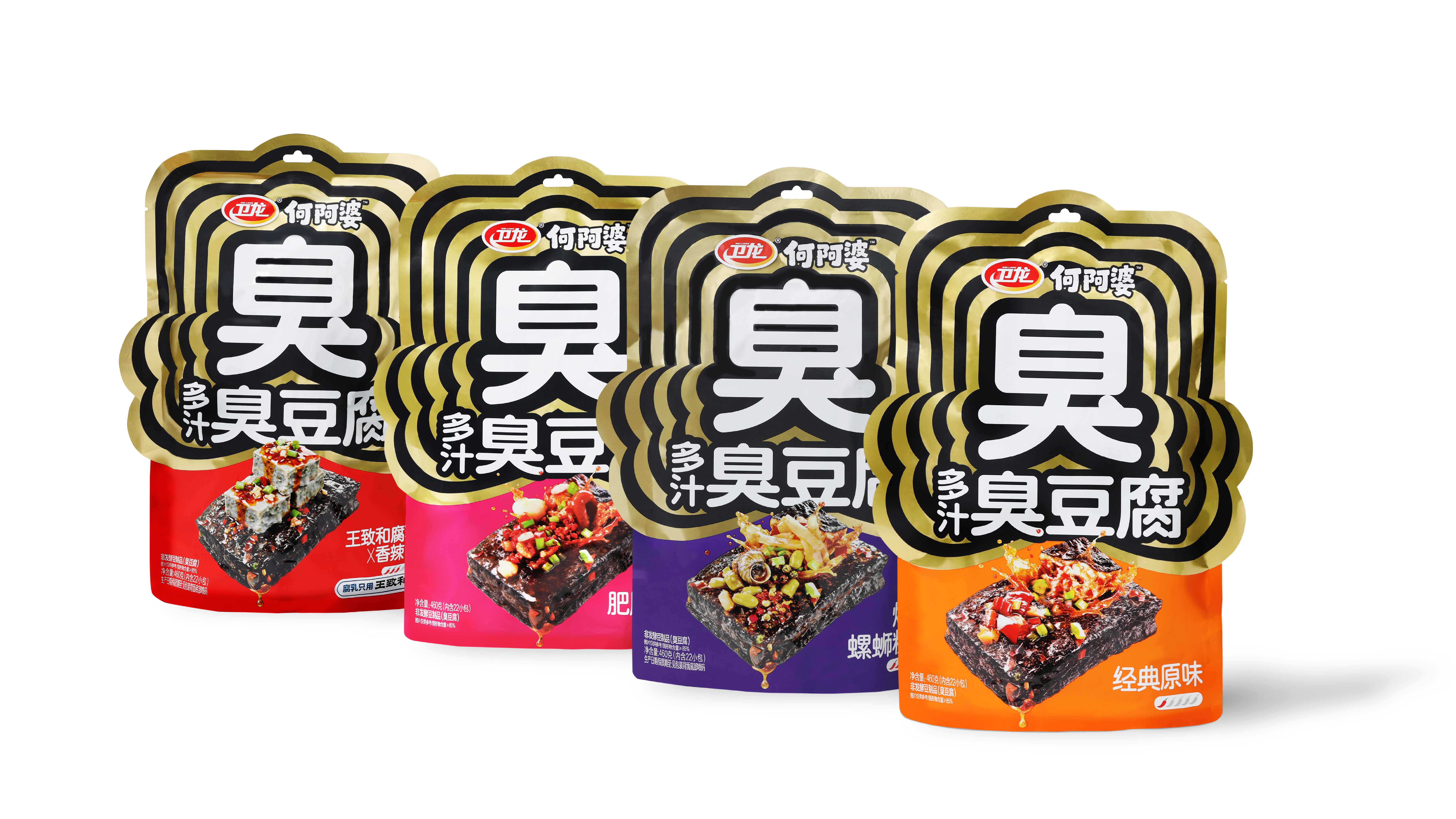
The packaging features a custom die-cut structure that echoes the contours of an expanding aroma, creating a distinctive silhouette that stands out on the shelf with greater visual impact.
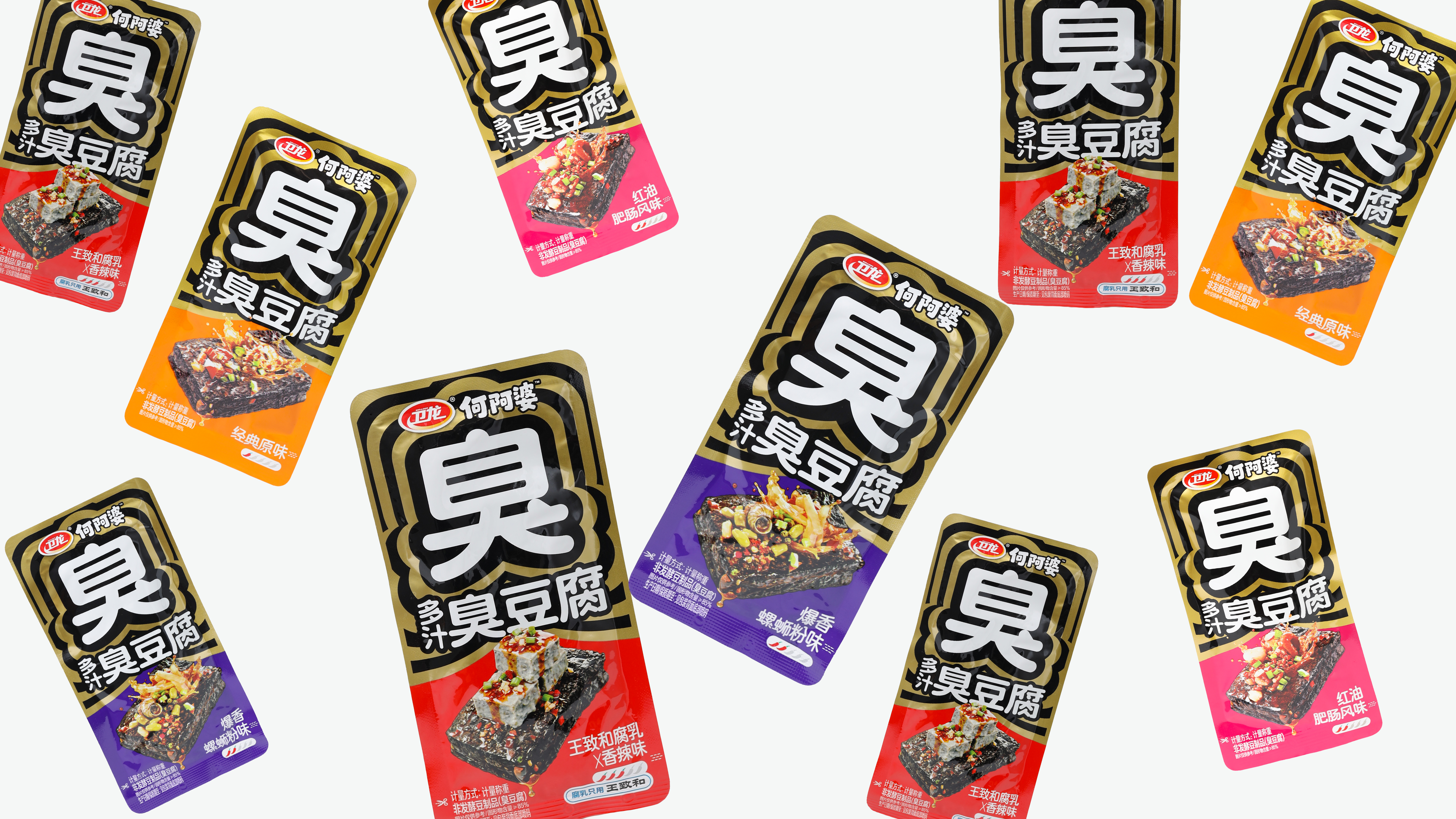
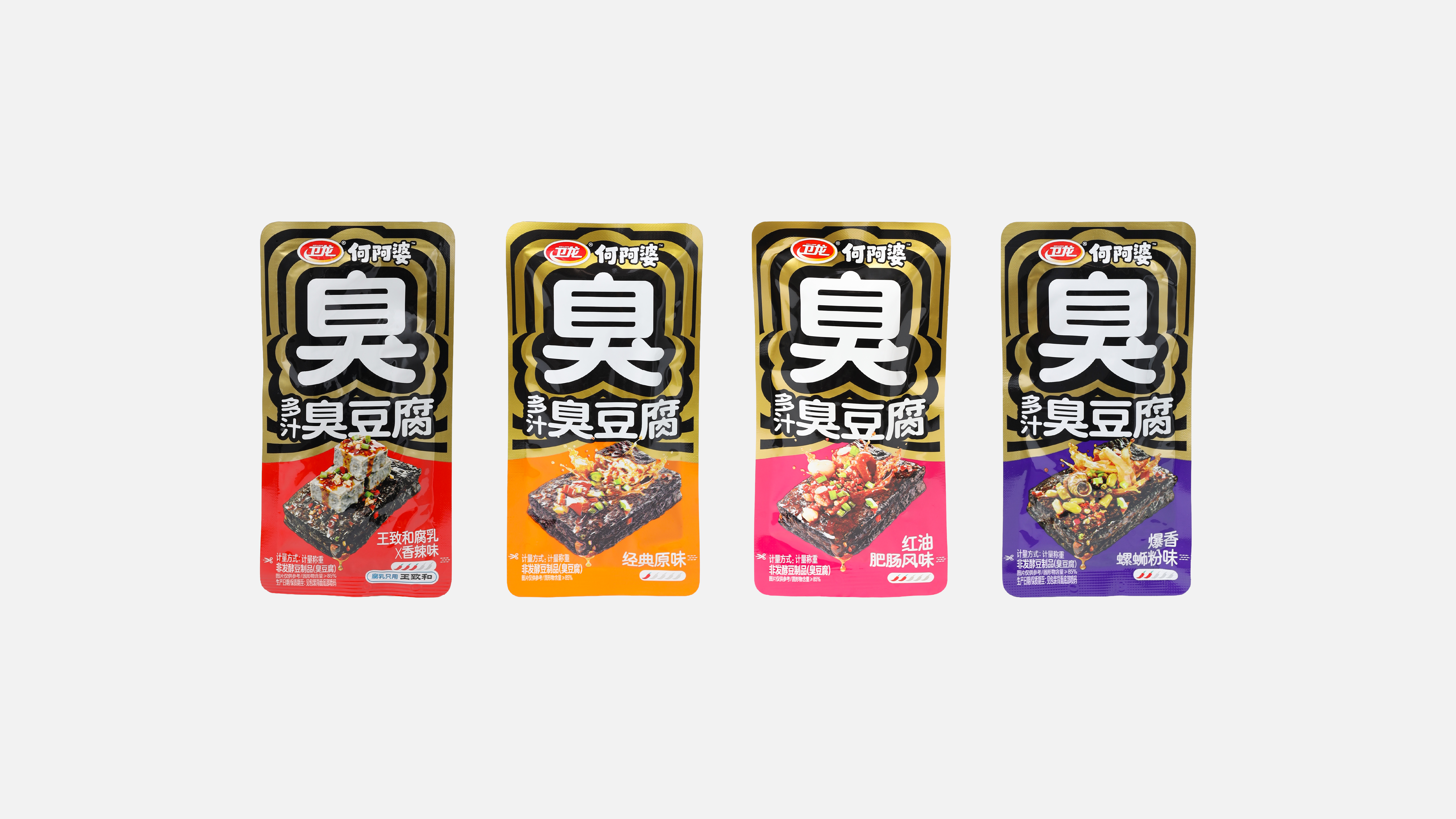
Black and gold form the core palette, reinforcing the bold flavor and perceived quality of the product. Red, purple, pink, and orange distinguish the different flavors, creating a cohesive product family with a dynamic rhythm across the shelf.
我们提取“臭”字作为主视觉,将它放在包装最中心,配合层层扩散的轮廓线条,模拟气味弥散、滋味迸发的状态,让臭豆腐的风味变得可视化。
包装结构上结合异形模切,让整包产品像一团“气味轮廓”,在货架上更有识别度和冲击力。
色彩以黑金为主,强化重口味和品质感;红、紫、粉、橙区分不同口味,形成统一又有节奏的系列陈列。我们希望通过这套设计,把臭豆腐最有记忆点的“臭”,转化成品牌独特的视觉资产。
色彩以黑金为主,强化重口味和品质感;红、紫、粉、橙区分不同口味,形成统一又有节奏的系列陈列。我们希望通过这套设计,把臭豆腐最有记忆点的“臭”,转化成品牌独特的视觉资产。